TL;DR
Tiny Tales, in a 5-day design sprint, developed a tablet-based reading platform to improve the parent-child reading experience. The design focused on user personas, empathy mapping, and problem statements, leading to a prototype emphasizing clear navigation and aesthetic consistency. Usability testing validated the success of the platform in streamlining story discovery for parents and addressing user needs within time constraints. Key learnings include understanding parent-child dynamics, efficient time management, and iterative design based on user feedback.
BACKGROUND
Prompt
Tiny Tales is a budding startup that provides a platform for authors and illustrators to publish children’s stories, allowing parents to read them to their kids. As their story library grows, parents have encountered challenges in finding suitable stories. The company aims to simplify story discovery to cater to parents’ needs.
Challenge
Tiny Tales seeks to create a Tablet App that streamlines story discovery for parents, making it easier to find and read captivating stories to their children. The design must address the constraints: the app should focus solely on digital reading without options for hard copies, printing, or external devices/apps.
Role
Using my experience as a parent of young readers, I took charge of designing and developing a reading platform interface that caters to the needs and preferences of both parents and children. From research to design, I handled the entire design process.
Project Process
Utilizing a 5-day design sprint, a design thinking methodology encompassing design, prototyping, and customer testing, I tackled problems and addressed business concerns. This rapid design sprint not only enhanced my time management skills but also provided valuable insights into resource constraints.
MAP
Rearticulating the Brief
Initially, I received a data brief of 11 surveys conducted with parents, along with a persona and an in-depth parent interview. I then analyzed this data to extract insights, successfully identifying the primary tasks and pain points that users encounter. This analysis played a pivotal role in forming a strong groundwork for my design and development strategy, enabling me to gain a comprehensive understanding of the challenges to be addressed.
Affinity Map
Having thoroughly examined the results of the brief, I created a catalog of the challenges articulated by users and pinpointed the essential tasks required for an optimal platform experience. Creating an affinity map enabled me to understand the necessity for parents to locate books that align with specific criteria such as length, age appropriateness, and content, all while having the ability to explore new books based on preferences and recommendations. Essentially, parents sought a more streamlined approach to discovering suitable books for reading to their children, aligning with their specific criteria.

User Persona
Through data analysis and careful project brief review, I created a user persona centered on Claire, our typical user. This approach helped pinpoint critical challenges and humanized the process, fostering empathy and connection. Understanding Claire’s needs, like finding educational books efficiently for her children, guides our design to meet user expectations effectively.
Empathy Map
Once the user persona was finalized, I could shift my focus towards Claire’s perspective and mindset as she engaged in the process of reading to her children. I delved further into her experience, aiming to comprehend her objectives, needs, and potential challenges when it came to reading a book to her kids. I wanted to foster a deeper connection with Claire and other users, enabling me to enhance the platform’s usability and effectively address the target user’s requirements with greater efficiency.

Problem Statement
After considering the insights gathered from the affinity mapping and persona, I focused on determining how I could assist the user. To address the users’ needs effectively, I devised six questions that would provide further clarity on the key problems that needed to be addressed to enhance the application according to users’ preferences.
These questions guided my planning process and aimed to uncover essential aspects for the app’s improvement:
- How can we streamline book selection for parents, reducing the time they spend on it?
- How can we personalize the reading experience through user profiles and customizable settings?
- How can we offer intelligent recommendations based on search criteria?
- How can we incorporate additional information such as genre, topics, age range, page count, and estimated reading time?
- How can we provide book recommendations tailored to the user’s reading preferences?
- How can we introduce a comment and rating system for books?
The problem is to improve an application catering to parents seeking suitable children’s books. Challenges include streamlining book selection, personalizing the reading experience, intelligent recommendations, integrating additional information, personalized suggestions, and introducing a user feedback system. The goal is to optimize the app for a more efficient and user-friendly experience.
Task Flow Analysis
Upon data compilation, I crafted a task flow and a preliminary user experience map, providing a visual roadmap for user interactions. Key focus areas included search, profile setup, book details, and review functions, deepening my grasp of the user journey and process intricacies.
SKETCH
LIGHTNING DEMOS
To progress further, a deeper comprehension of the platform’s requirements and utilization was crucial. This involved analyzing both effective and ineffective elements of existing applications, allowing for the design and development of a platform that learns from the mistakes of its predecessors. During this process, I thoroughly assessed four children’s book reading platforms, documenting ideas for UI assets and potential redesigns that could be integrated into my own application.
- Platform’s kid-friendly and simple layout is appealing.
- Bright colors, recognizable icons, and large pictures are positive.
- Lacks customization and search options compared to other platforms.
- Well-designed book listing and layout.
- Simple and easy-to-read iconography.
- Kid-friendly layout and iconography can be adapted for Tiny Tales.
- Large iconography on bottom task bar aids children’s navigation.
- Genre list for scrolling found to be useful.
- Appreciate book organization and genre layout.
- Pleasing iconography.
- Cluttered UI and small icons need improvement for Tiny Tales platform.
CRAZY 8'S
After identifying potential opportunities for Tiny Tales based on competitors’ shortcomings, the next step was to create screen designs. Employing the Crazy 8’s design method, I quickly generated and sketched diverse design concepts. This technique encouraged a more profound exploration of interface potentials for the platform, enabling creative exploration of various design options and ideas.


Solution Sketches
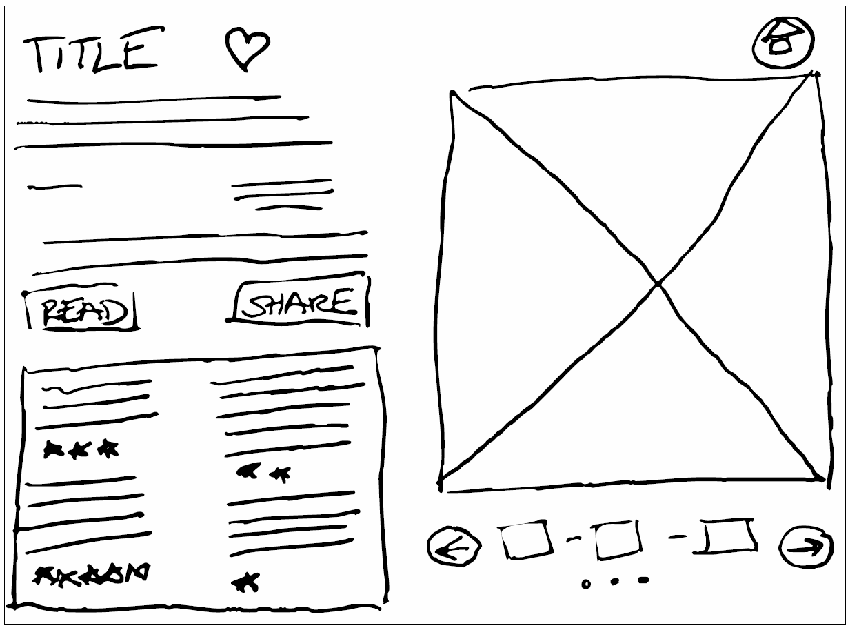
Choosing from numerous sketches, I selected one that embodied my vision for Tiny Tales, emphasizing book details, search functionality, and user tasks. This screen formed the basis for book exploration, recommendations, and library access, with navigational icons and profile avatar as crucial components. This guided the solution sketch, focusing on streamlined parent searches for book information.
DECIDE
Site Map
Having a preliminary platform design, I proceeded to identify essential pages for its tasks. This involved crafting a detailed sitemap, which formed the foundation for the storyboard and prototype. This visual representation guided the platform’s logical and efficient structure and design.
Storyboard
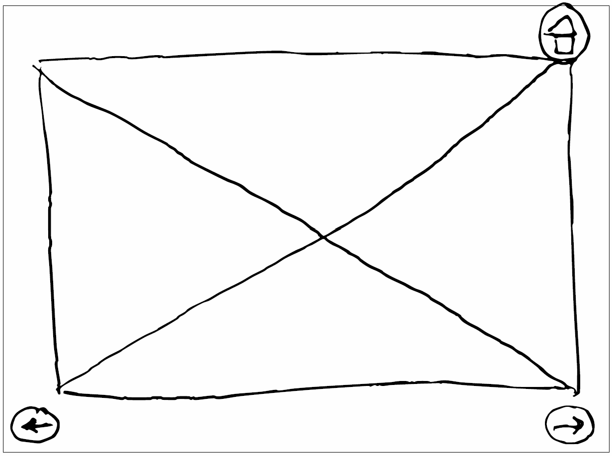
Using the sitemap and solution sketches as guides, I formed a framework for the MVP’s essential pages. Drawing from lightning demos and solution sketches, I shaped the final storyboard design, incorporating key assets and choices for the prototype outline. These sketches were crucial in solidifying task flow and user paths within the prototype. Utilizing rough sketches allowed for flexible, creative interface design, swiftly bringing ideas to life and reflecting user task flow.
PROTOTYPE
Final Prototype
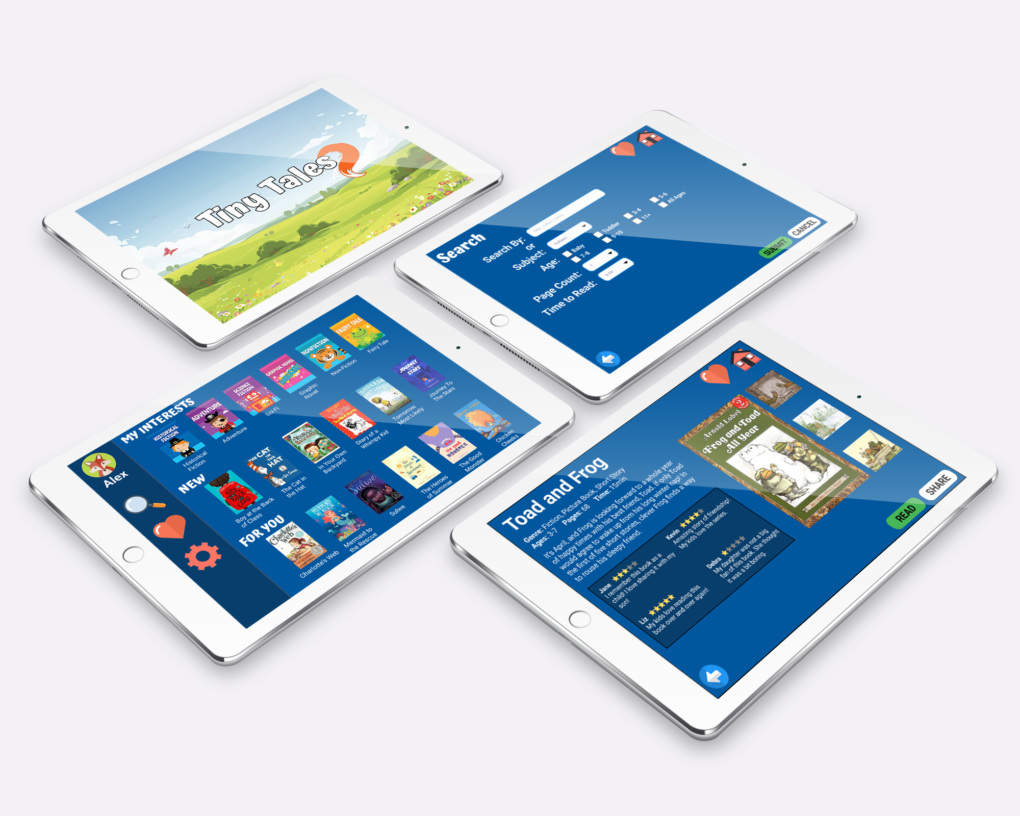
Building on the storyboard, I created a Figma prototype, refining button placement, assets, and layout. Tablet screens were prioritized for essential tasks, focusing on aesthetics and flow. Testing will evaluate the design’s ability to meet user needs. I’m dedicated to incorporating feedback for an improved user experience. The final screens highlight key elements, aiding users in finding appropriate books for their children.


TEST
Usability Testing
Testing Phase: The testing phase comprised three in-person and two Zoom sessions. Participants were given specific tasks from a test script to perform on the Figma prototype. Their actions, decisions, and feedback were meticulously recorded, assessing task success and user experience through process flow, body language, and verbal input. This data informed potential prototype iterations.
User Profiles: I interviewed five parents who frequently read to their children, selected from a compiled list of target users who had children of various reading ages.
Experience in Interviewing & Testing: I adeptly crafted a task-oriented script that addressed users’ actions and pain points from initial interviews. By tailoring tasks, I demonstrated how design modifications eased tasks and resolved issues.
Sample Tasks:
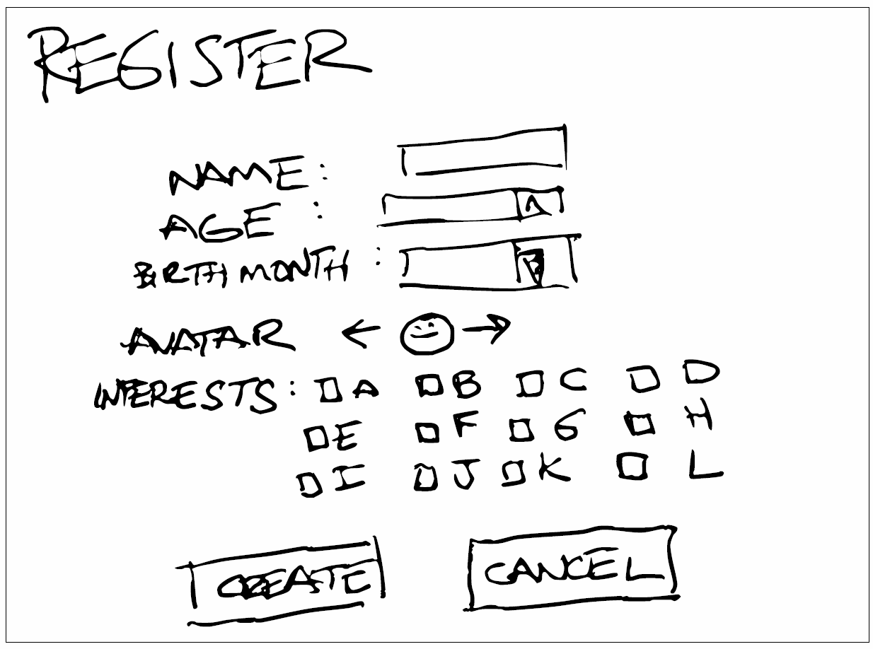
- Profile Creation: Instruct users to create a new profile.
- Account Customization: Guide users to log in as Penny and enable audiobook captions.
- Book Search: Direct users to use the search function to find a specific book.
- Adding to Favorites: Ask users to add “Frog & Toad” to favorites from search results.
- Sharing Feature: Instruct users to share “Frog & Toad” with a friend via email from favorites.
- Reading & Reviewing: Encourage users to read “Frog & Toad” and leave a review.
Summary of Findings: All users successfully completed the tasks, except for one who made a simple navigation error due to hurrying. The straightforward nature of tasks led this user to rush, resulting in misclicking. Users praised the design’s simplicity and user-friendliness. They particularly appreciated the large icons and design elements that enhanced the interface, making it suitable for both parents and children.
REFLECTIONS
POST-MORTEM
Tiny Tales accomplished its objective of simplifying book reading for parents and children. The 5-day design sprint streamlined decision-making and validated the platform’s user-centered approach. Successful usability testing validated the design choice. Future iterations aim to enhance browsing and further personalize the reading experience.
Successes
- User-Centered Design: Successfully addressed user pain points and needs.
- Rapid Iteration: Employed design sprint methodology to refine ideas efficiently.
- Usability Testing: Prototype achieved successful task completion with users.
- Clear Navigation: Designed a logical and intuitive end-to-end task flow.
- Aesthetic Consistency: Created an intuitive interface that was consistent throughout the various screens, catering to both parents and children, ensuring ease of understanding and navigation.
Challenges
- Limited Time: The 5-day sprint demanded rapid decision-making and execution.
- Resource Constraints: Limited access to art resources impacted visual assets.
- User-Centric Approach: Balancing the preferences of both parents and children.
- Iterative Process: Incorporating feedback promptly during design iterations.
KEY LEARNINGS
- Parent-Child Dynamics: Understand the dynamics to design for both audiences.
- Time Management: Efficiently manage limited time for better productivity.
- Rapid Prototyping: Iteratively refine designs based on user feedback.
- Resource Adaptation: Create effective solutions within resource constraints.
- Usability Testing: Validate designs with users to identify improvements.


