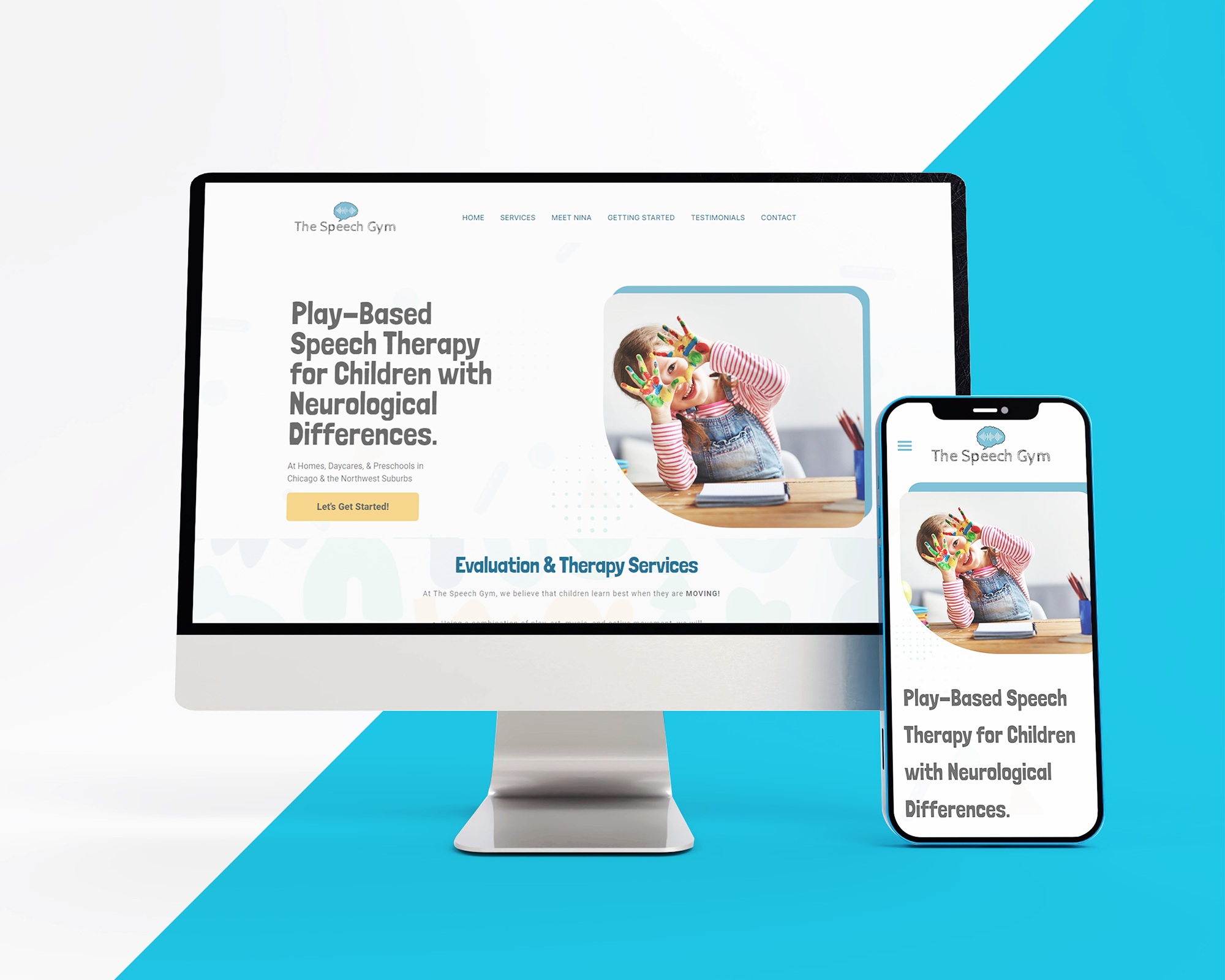
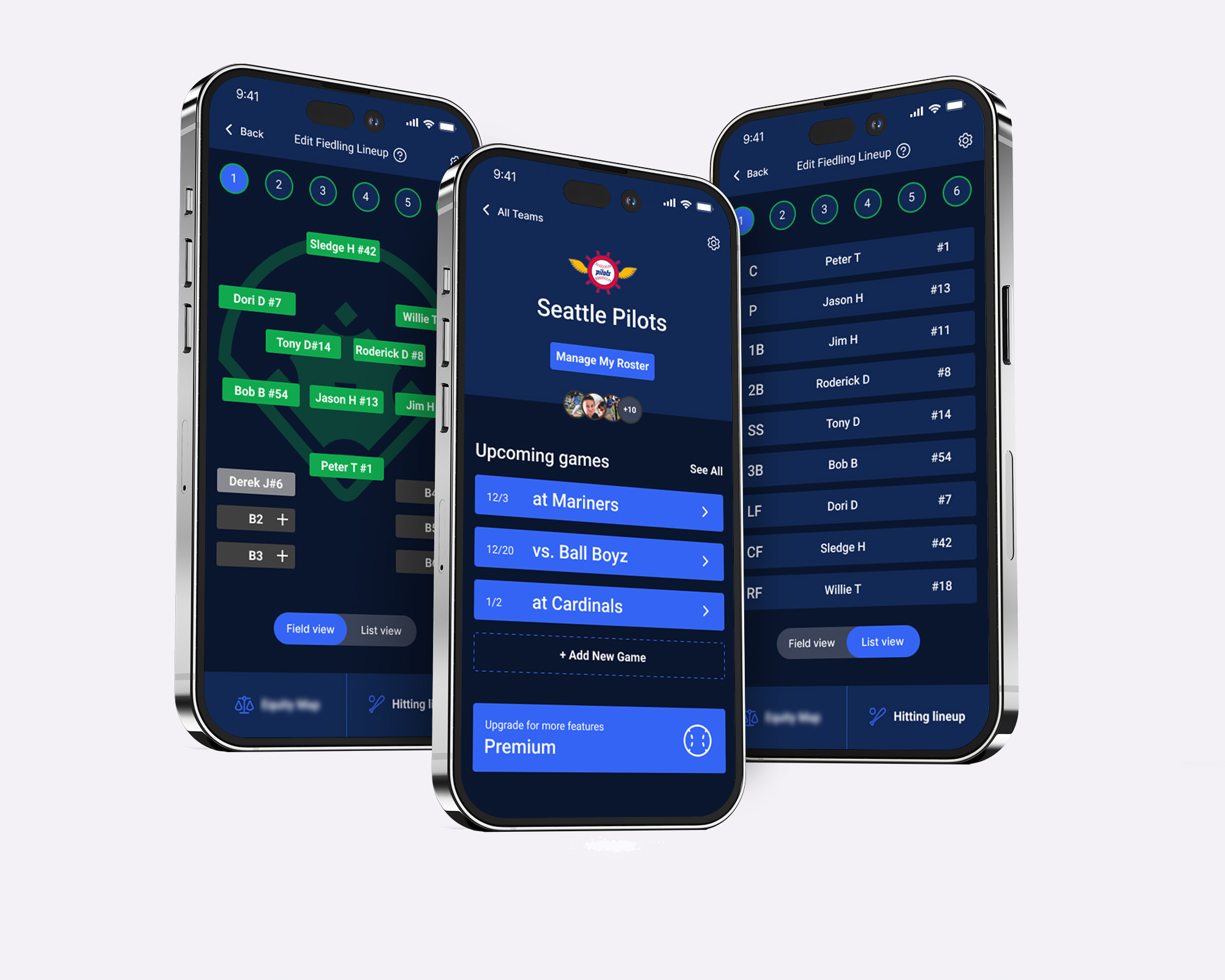
The Speech Gym App
Elevating communication and growth for early intervention with a mobile platform that connects therapists and clients in The Speech Gym’s innovative in-home therapy sessions.
DELIVERABLES
Style Guide
Final Design & Prototype
ROLE
Sole Designer
TOOLS
Figma
Miro
Adobe Creative Cloud
Google Forms
DURATION
7 Months
TL;DR
The Speech Gym App outlines the creation of a mobile platform to enhance speech therapy sessions for The Speech Gym PLLC, focusing on early intervention. As the project’s sole designer, I employed various design tools over six months to produce a user-centered, accessible interface. The process involved extensive research, usability testing, and iterative design to meet the specific needs of therapists and parents. Despite challenges like diverse user requirements and a lack of similar platforms, the project succeeded in delivering a highly usable and effective therapy management solution.
BACKGROUND
Client Introduction
The Speech Gym PLLC operates as a speech-language pathology therapy clinic situated in Chicago, specializing in early intervention for young children. Delivering in-home therapy, the clinic employs diverse lessons, educational tools/toys, and therapeutic techniques to assist a range of clients.
Challenge
Create an integrated app for The Speech Gym PLLC, emphasizing early intervention and equipping therapists with advanced communication tools, aids, and methods. This innovation aims to optimize the therapeutic experience for young clients, nurturing their growth and development.
Role
Taking the lead as the sole UI/UX designer, I designed the mobile platform. This case study showcases my expertise in creating a user-friendly mobile experience for speech-language pathologists (SLPs) and patients’ parents. Through interviews, research, testing, and design heuristics, I demonstrated my ability to produce a comprehensive platform that enhances the user experience for therapists and patients.
EMPATHIZE
Client Interview
To initiate the design process for The Speech Gym’s companion app, I conducted an in-depth interview with the clinic owner to capture their vision, requirements, and additional ideas for the app. By maintaining an open-minded approach and facilitating a creative brainstorming session, we were able to identify and prioritize the essential features needed to tailor the app precisely to the owner’s expectations.
- Therapy Plan Management:
Empower Speech-Language Pathologists (SLPs) to efficiently oversee personalized therapy plans tailored to each child’s individual needs and goals. The app’s user-friendly interface enables SLPs to add, edit, and view sessions, exercises, interventions, and treatment materials, addressing specific speech and language challenges for optimal progress. - Comprehensive Video Library:
Showcase a diverse library of meticulously crafted therapy videos created and uploaded by SLPs. Accessible to SLPs, the library offers instructional videos demonstrating various techniques, exercises, and engaging games to stimulate young learners both during and after therapy sessions. - Parent Collaboration:
Facilitate collaboration between SLPs and parents through real-time sharing of therapy plans and progress updates. Parents can actively participate in their child’s development by engaging in therapy activities at home, guided by SLP-approved resources. - Secure Communication:
Ensure a secure platform for communication among SLPs, parents, and caregivers, enabling the exchange of feedback, questions, and insights within a protected digital environment that adheres to HIPAA standards.

Secondary Research
Given the absence of mobile applications meeting the specific requirements outlined by the client for Speech-Language Pathologists (SLPs), I opted to explore articles related to therapists and the utilization of mobile applications in therapy sessions.
"Listening to Stakeholders Involved in Speech-Language Therapy for Children With Communication Disorders: Content Analysis of Apple App Store Reviews" (Du et al., PMID: 35060912)
- Participants: Parents, educators, individuals with communication disorders, SLPs.
- Apps Analyzed: 16 covering various competencies.
- Reviews Examined: 721 from 2009 to 2020.
- Users’ Problems: Consistent usability issues in apps, attributing them to design guideline violations in aesthetics, user errors, controls, and customization.
- Findings: Stakeholders use App Store reviews to share experiences. Usability issues identified in augmentative and alternative communication (AAC) apps by parents. Speech-language app reviews by SLPs and educators emphasize feature requests.

“Speech-Language Pathologists’ Feelings and Practices Regarding Technological Apps in School Service Delivery” (Olszewski et al., PMID: 35917463)
- Participants: School-based SLPs in Ohio (69 valid responses).
- App Usage: 77% of SLPs reported using apps in treatment sessions.
- Factors Considered: Age, cognitive ability, and treatment targets influenced app use.
- Non-Users’ Reasons: Personal preference and price were common factors.
- Concerns: Some SLPs noted concerns about excessive screen time.

“They Can’t Believe They’re a Tiger”: Insights from pediatric speech-language pathologist mobile app users and app designers (Du et al., PMID: 37219400)
- Participants: 37 licensed pediatric SLPs.
- App Usage: 23 SLPs used apps, 14 contributed to app design.
- App Genres: Assistive, educational, and recreational game apps used for diverse disorders.
- Design Emphasis: SLPs designing apps stressed evidence-based practice and well-researched teaching methods.
- Influential Factors: Financial, sociocultural, political, and ethical factors impacted app design, adoption, and implementation.

User Surveys/Interviews
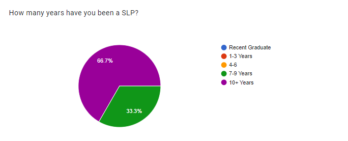
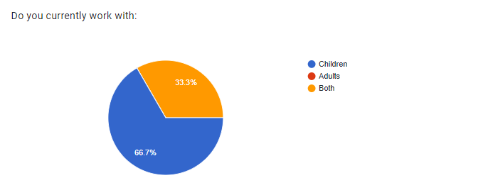
I aimed to understand the needs and challenges of other Speech-Language Pathologists (SLPs). I distributed a survey to 25 SLPs, focusing on experienced practitioners working with children, our target user group. From survey responses, 17 SLPs completed a questionnaire on therapy methods, materials, and app usage. This method collected ideas and feedback, guiding feature incorporation to support therapists during sessions.

Affinity Mapping
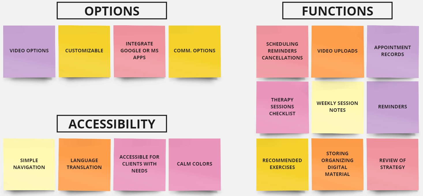
Compiling information from both the client interview and user questionnaires, my task was to analyze the data and identify common themes for effective organization. I successfully categorized the data into three essential groups vital for the application: Options (customizable functions), Functions (tasks required by therapists for their therapy plans), and Accessibility (options and layout designed for enhanced client accessibility).
User Journey
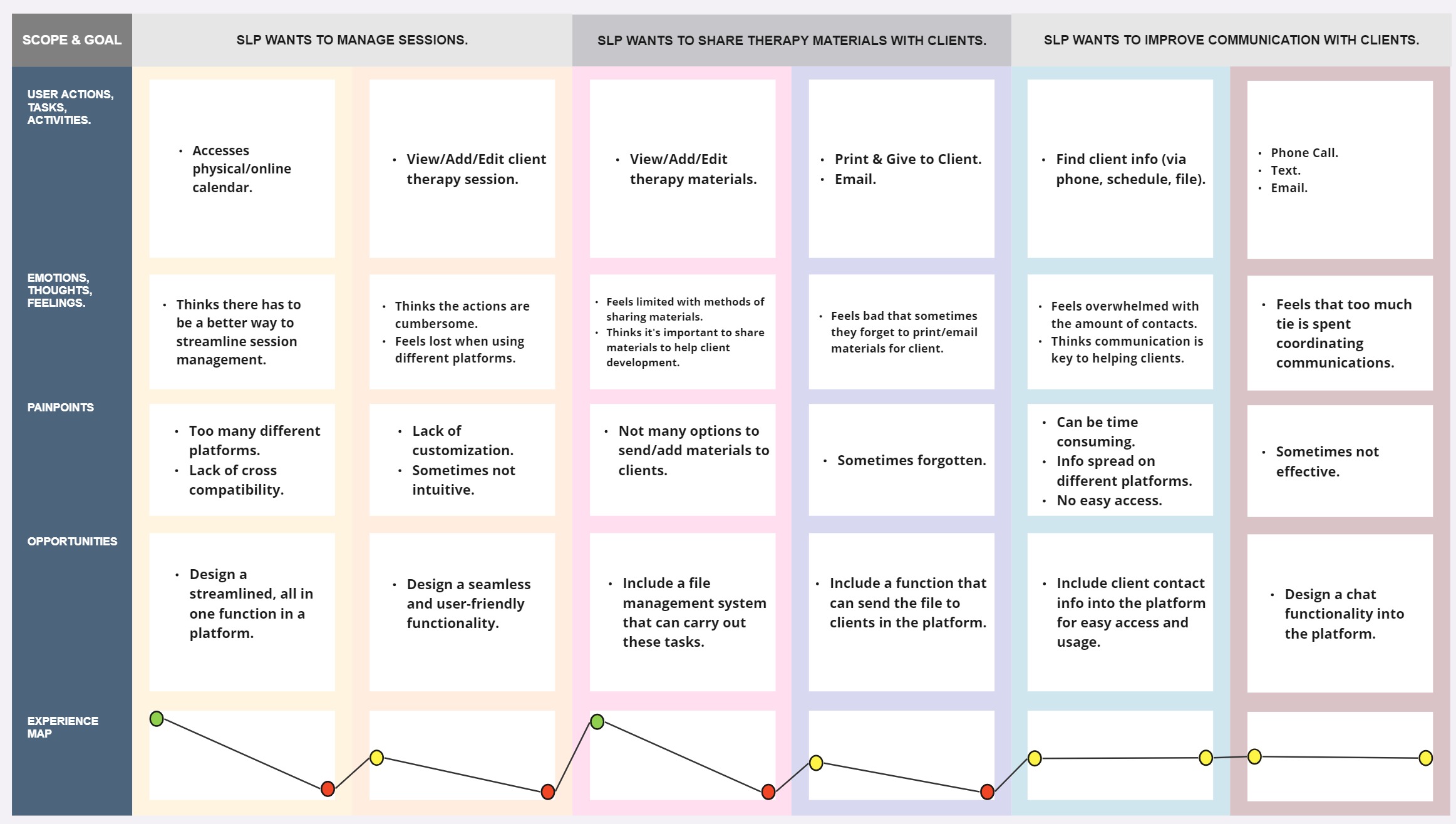
After reviewing the therapists’ feedback and interview data from the clinic, I developed a framework to identify the tasks they wished to optimize for greater efficiency.
This led to the identification of three primary objectives:
- Session Management.
- Distribution of Therapy Resources to Clients.
- Enhancement of Communication between Clients and Therapists.
By understanding our target users, I learned about their inefficient workflows, burdensome tasks, limited communication options, and feelings of being overwhelmed. This insight helped identify areas for improvement, like a user-friendly calendar, cohesive file management, and seamless chat. Mapping their journey let me advocate more effectively with deeper empathy.
DEFINE
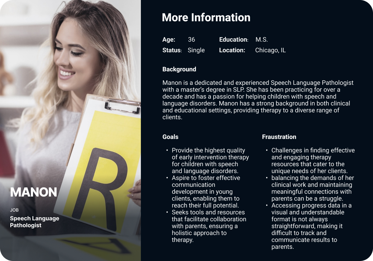
User Personas
After understanding the target users (early intervention therapists and client parents), I developed personas to advocate for within the platform. Visualizing the requirements of both parents and therapists facilitated the design process, ensuring adherence to a user-centered design approach.
User Stories/Mapping
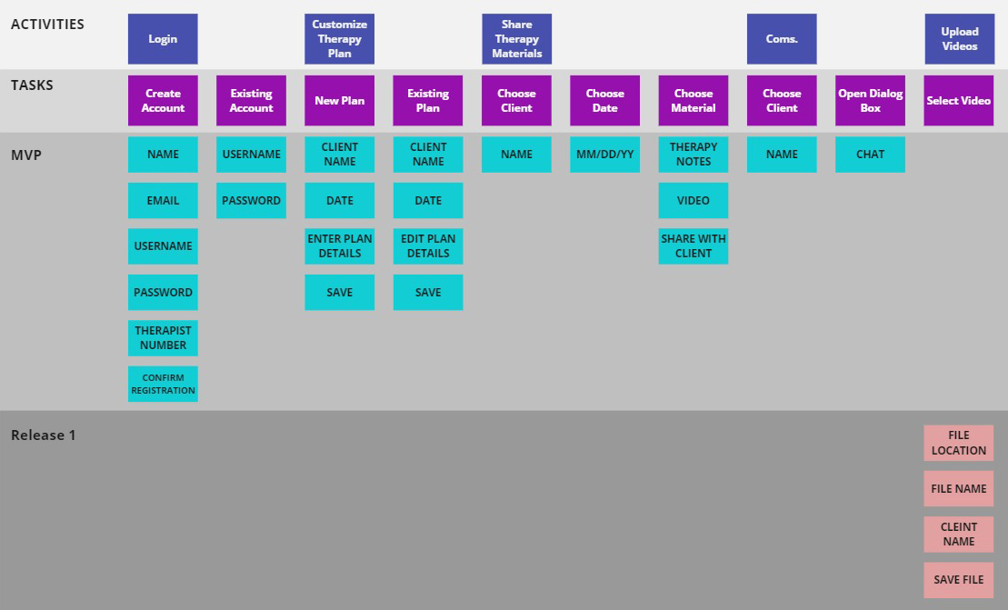
With the personas in place to champion for, I could delve deeper into the user’s needs and goals by specifying crucial tasks and functions. The User Story map delineates releases, release goals, and prioritized features concerning the implementation and operation of the app. This comprehensive understanding directed the design process, emphasizing tasks such as Customizable Therapy Plans, Sharing Therapy Materials, Video Content Management, and Communication methods.

Problem Statement
The Speech Gym App highlights the challenge of creating a user-friendly interface for early intervention therapists and client parents. Existing mobile applications lack comprehensive features, hindering efficient therapy plan management and collaboration. The goal is to design an app that addresses these issues, providing a seamless and engaging experience while supporting therapists and enhancing the overall therapeutic journey for young clients through an intuitive session calendar, file management system, and a messaging system.
IDEATE
Site Map
The development of the site map for The Speech Gym PLLC’s accompanying app was a crucial step in organizing and structuring the content to ensure a coherent and user-friendly design. The following is a breakdown of the site map’s key elements: Login(Therapist & Client), Therapy Plans, Therapy Materials, Video Uploads, and Communication. It addresses user needs for clarity, orientation, and easy access to content.

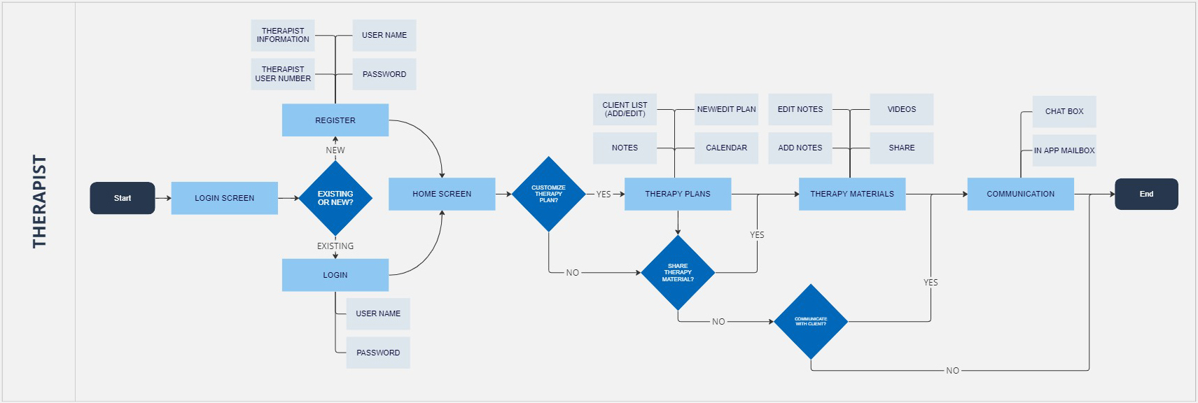
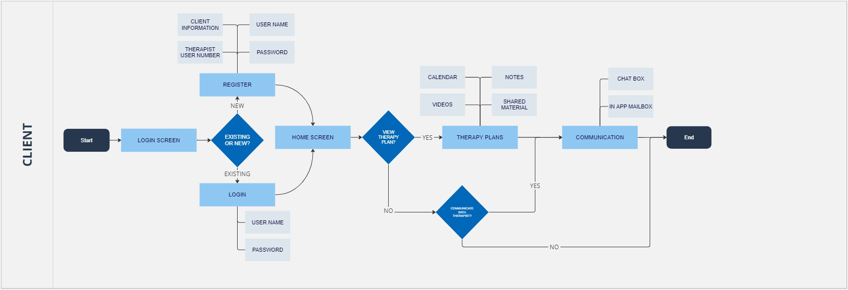
User Flow
The user flow of the app has been crafted for a seamless experience, optimizing entry points like the Login Process, Therapy Plans, Materials, and Communication. Thoughtful branching points denote task options, aligning with user expectations and behaviors for enhanced usability.
Sketches to Wireframes
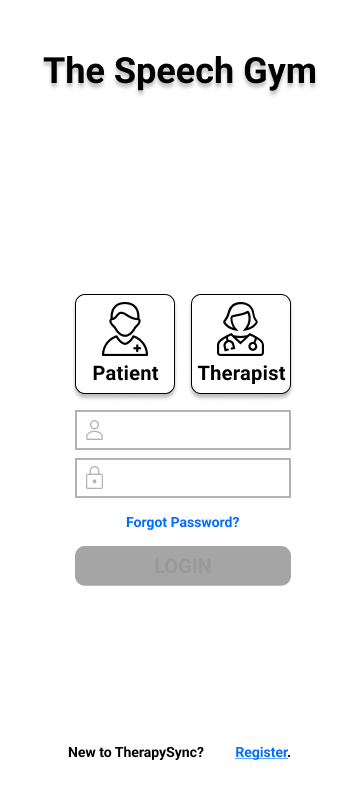
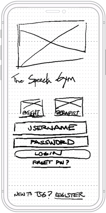
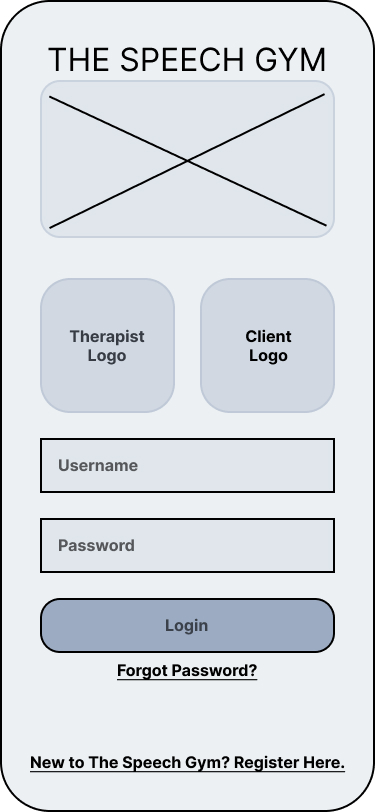
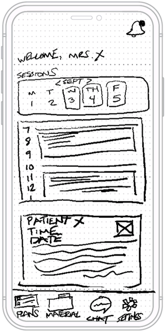
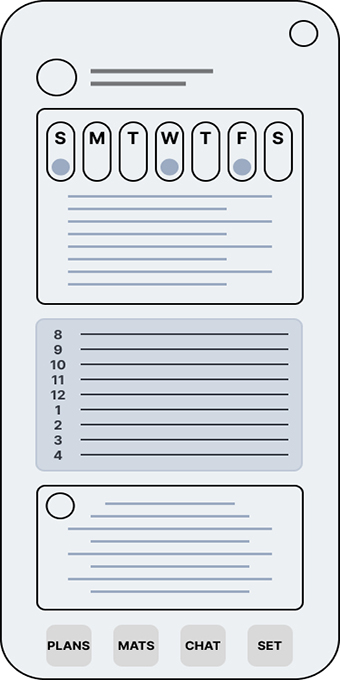
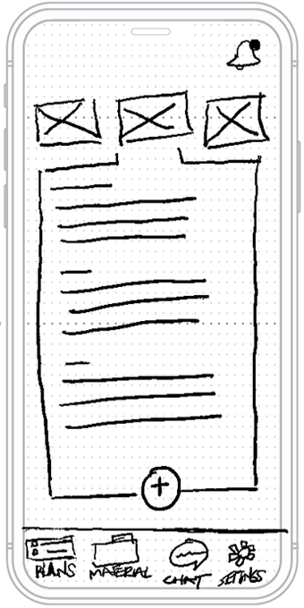
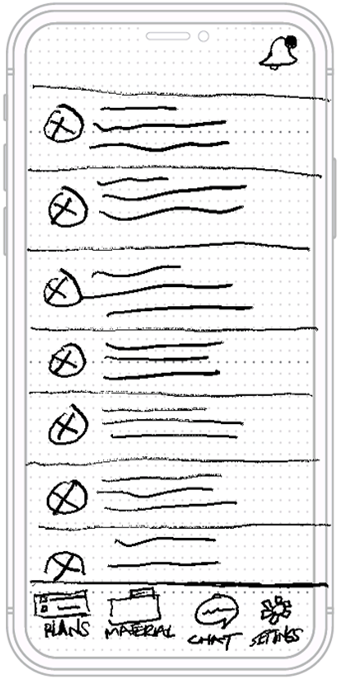
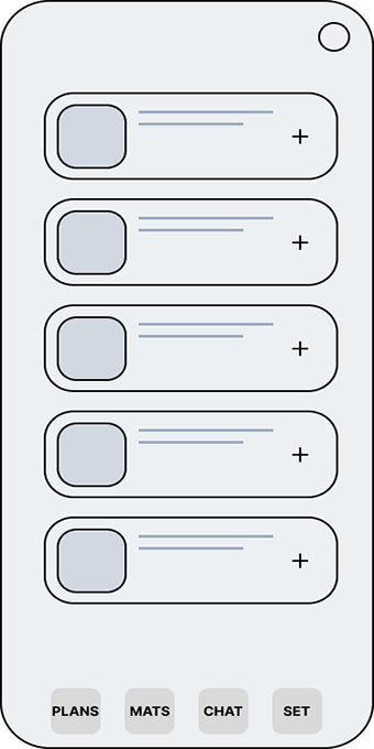
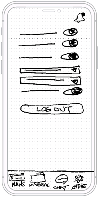
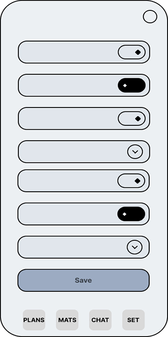
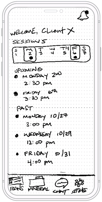
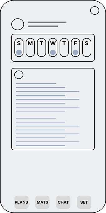
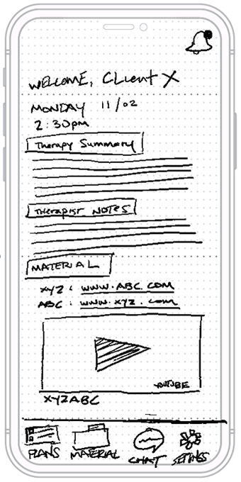
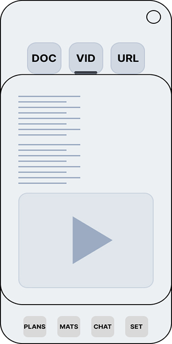
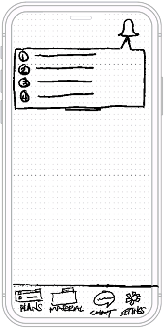
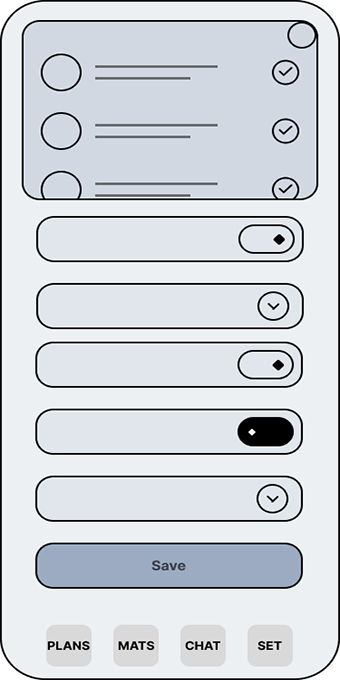
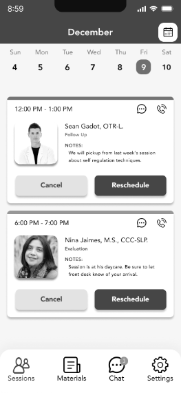
After creating the information architecture, I began sketching screens for crucial user tasks. These sketches included clear icons for navigation, a calendar for appointments, a document section for sharing materials, and a chat function for client-therapist communication. I then turned these sketches into wireframes, forming a functional platform for designing the prototype.

Low-Fi Prototype
Building upon the wireframes, I developed a low-fidelity prototype by adding details and functionality. This included interactive components like a therapy session calendar, file upload, chat selection, settings page, and notification alerts. By focusing on functionality over aesthetics, users could test the prototype’s core features. This approach aimed to gather comprehensive data during usability testing, informing the final prototype’s construction.
TEST
Usability Testing
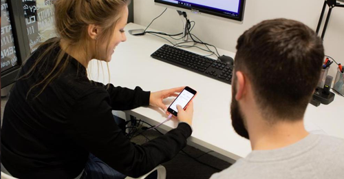
After creating the wireframes, I conducted user testing to evaluate their experiences with the platform’s design. This involved 10 sessions—5 in-person and 5 online—with 5 speech therapists and 5 parents of clients. Participants followed tailored scripts, and their actions were recorded. The analysis focused on their interaction with the Figma wireframes, aiming to assess performance and preferences based on assigned tasks over one week.
ASSIGNED TASKS:
- Navigate the Login Process (for both Therapist & Client).
- Add a document (for Therapist)/ View a document (for Client).
- Access your notifications.
- Access Chat with client/therapist.
- Provide additional comments.

Usability Test Report
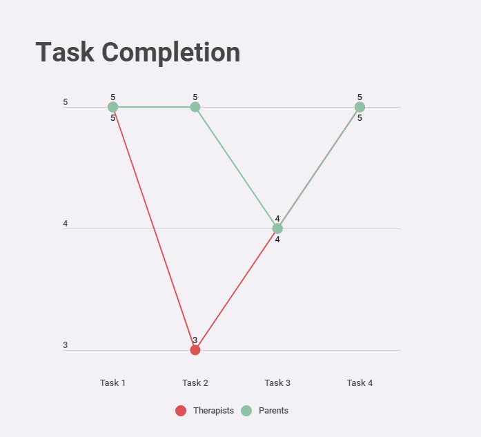
The usability test results identified two instances where the target users encountered challenges or difficulties in task completion. The insights gained from these unsuccessful tasks offer valuable guidance for enhancing iterations of the current design to make it more user-friendly.
DOCUMENT ADDITION:
During the test, one therapist searched for a link to upload a document using large icons, while another clicked on the magnifying glass in the search menu. Both eventually found the “Plus Icon” at the bottom of the page. The concern raised was about consistency in the “Add/Plus” functionality across screens and its similarity to widely used file management apps like Google Drive.NOTIFICATION ACCESS:
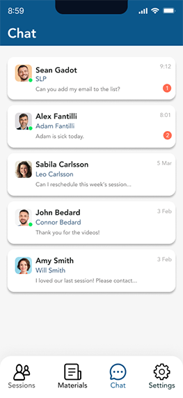
During the test, a therapist and a parent searched for a way to access user notifications, indicating that the “Bell” icon’s significance was unclear in the design. The primary concern was finding a better method and placement for notifying users of changes/updates. One suggestion was placing a notification circle near the bottom navigation icons for better visibility and significance.
Additional user comments:
- “I like the calendar functions, but it’s a little too crowded and a bit messy.”
- “I am very accustomed to using Google Calendar for much of my everyday appointments.”
- “The materials screen is a nice feature, but its a little awkward to use.”
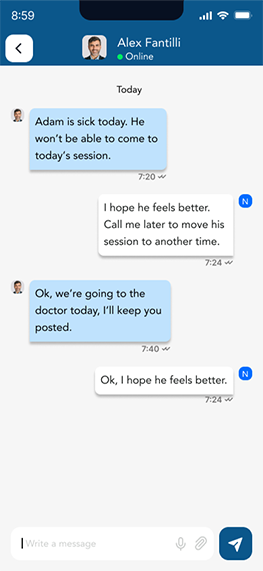
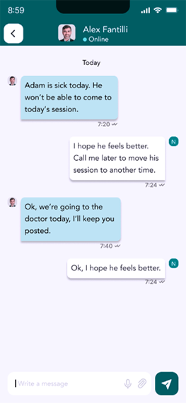
- “The chat function is easy to use would be so helpful in communicating with parents of clients.”
FINAL DESIGN
Style Guide
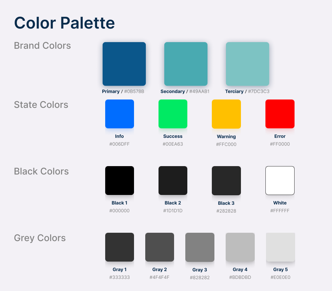
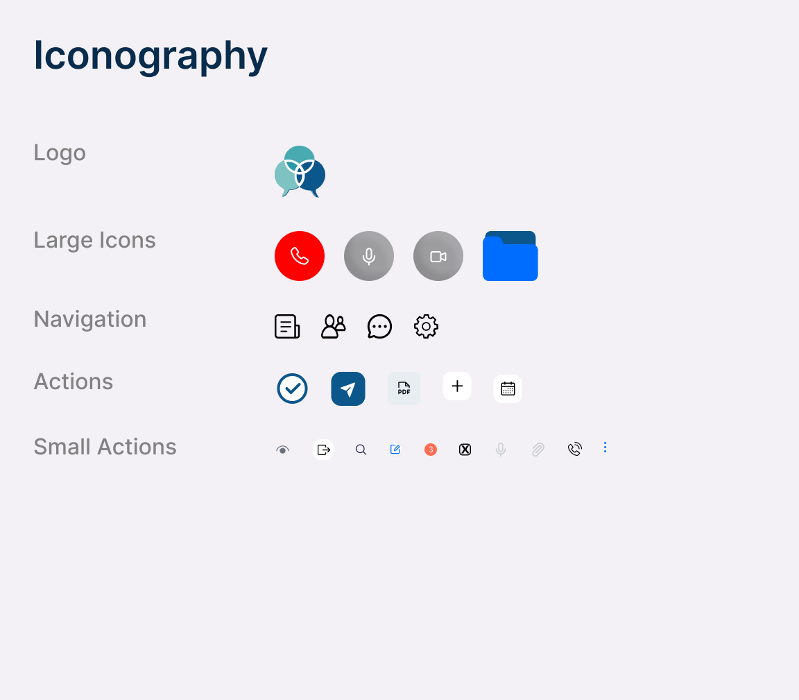
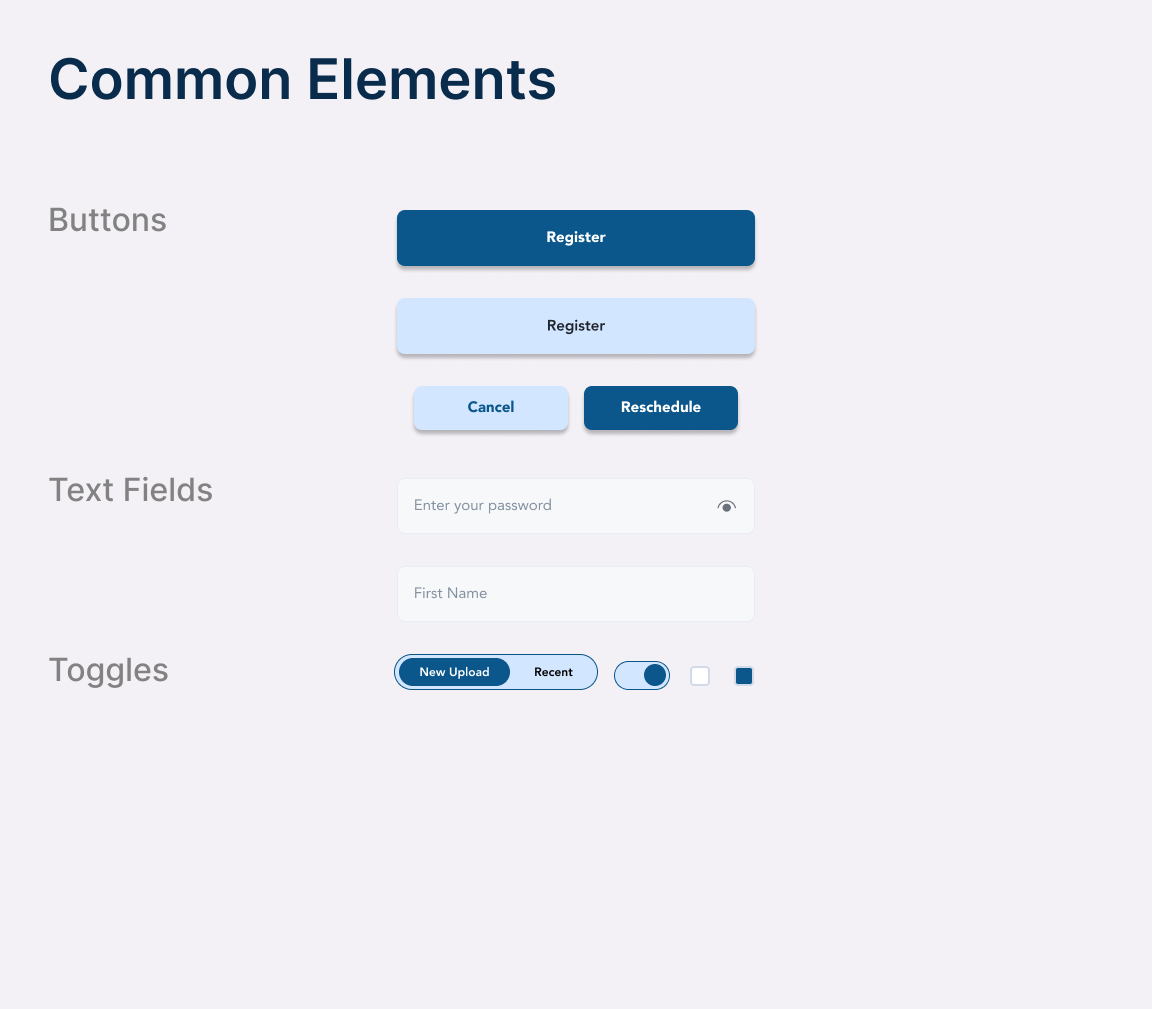
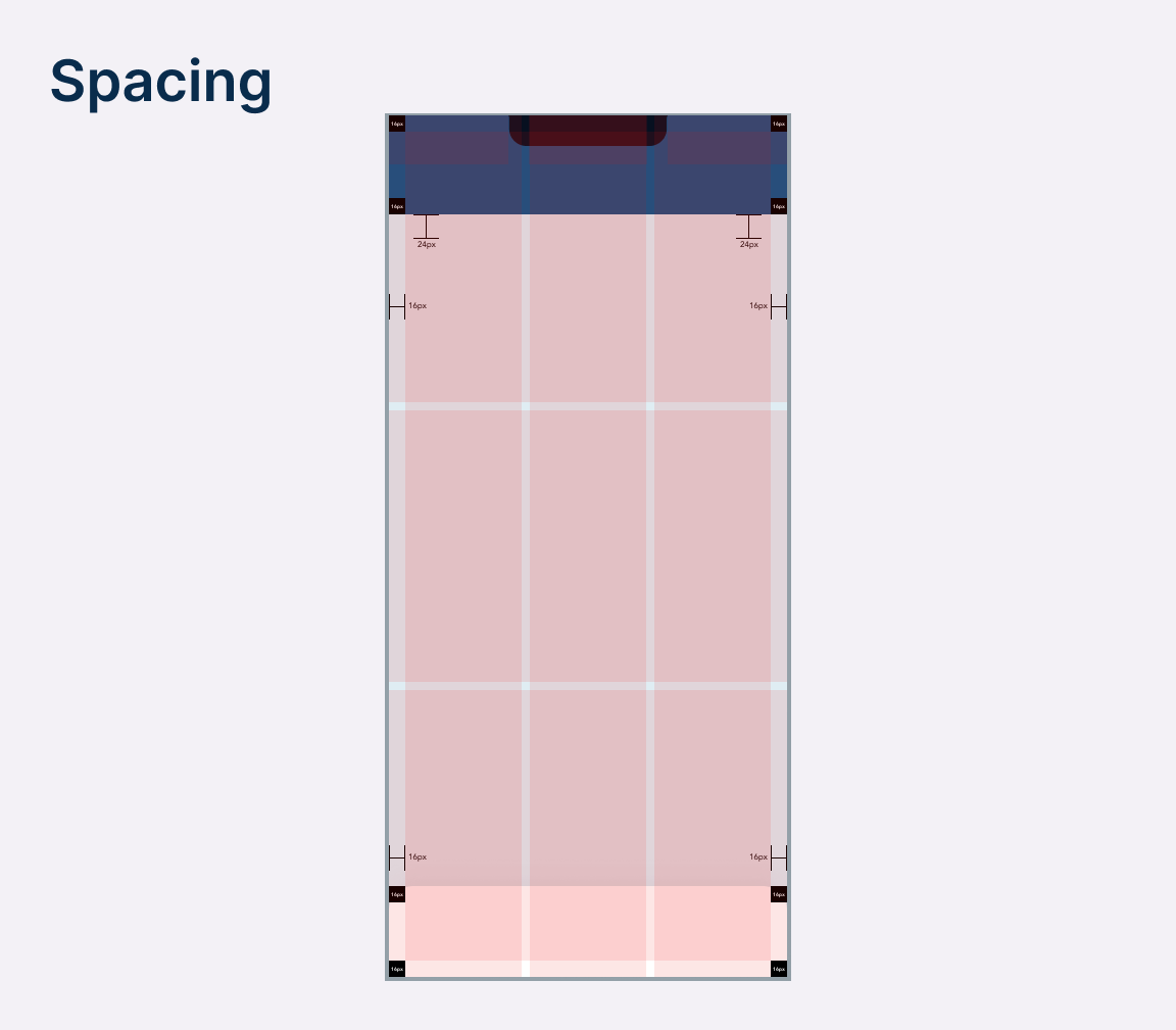
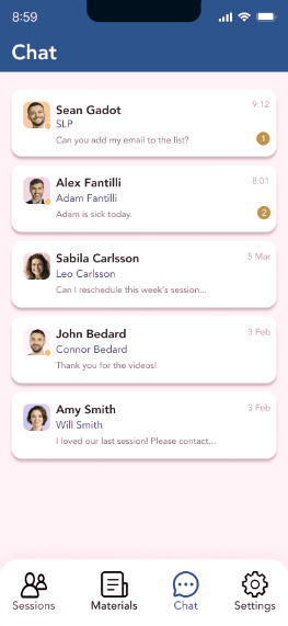
To ensure design coherence, I created a style guide for future updates. I chose a soothing color palette with shades of blue and green, improving usability with a sans-serif font (Avenir) for legibility. Icons were designed straightforwardly. Accessibility was prioritized with contrast-friendly colors and consistent spacing for a uniform visual flow.
Final Prototype Design
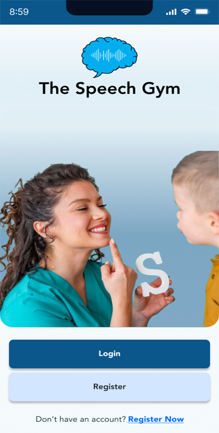
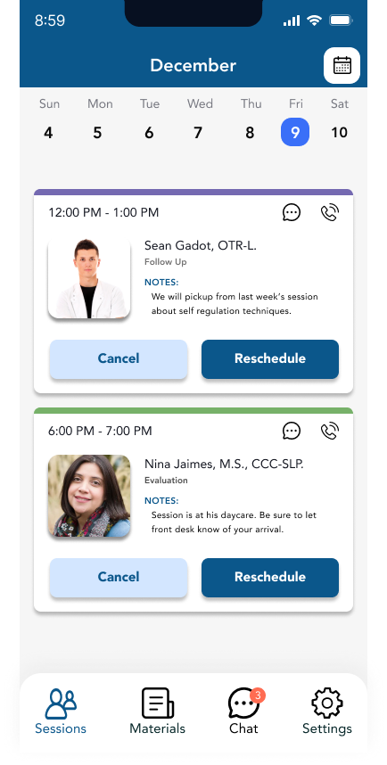
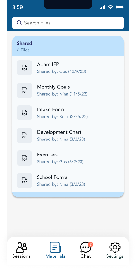
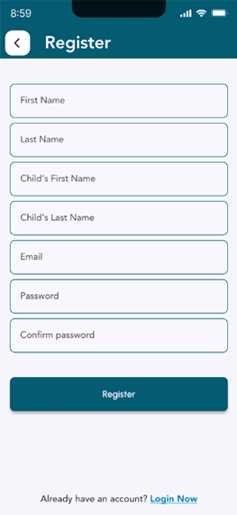
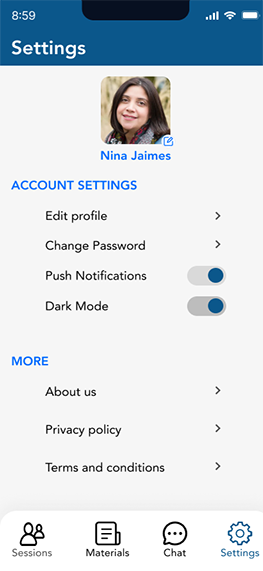
Based on usability testing feedback and data, I made design adjustments to better meet user requirements. Using low-fidelity prototypes as a baseline, I improved the login process, made the calendar feature more accessible, and enhanced the file management system. These changes enriched the final prototype with a cohesive design, better iconography, improved functionality, and increased accessibility.
Accessibility
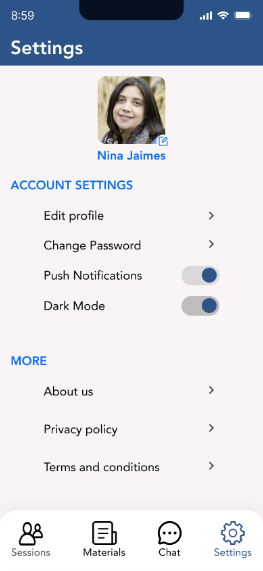
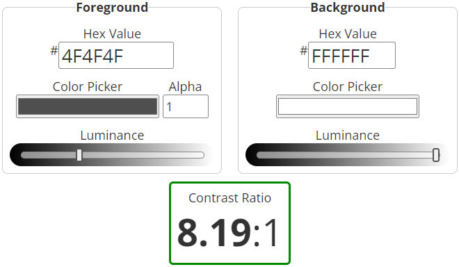
Verifying compliance with accessibility standards involved conducting a series of tests on the platform to ensure its design supported accessibility. The selection of the color palette, background colors, text sizes, button designs, and the overall layout was carefully executed to maximize color contrast for readability in accordance with WCAG2 and APCA guidelines. Additionally, the color palette was chosen to accommodate different types of color vision deficiencies.



REFLECTIONS
POST-MORTEM
By engaging in detailed primary research with both therapists and their clients, and conducting in-depth secondary research, I acquired a thorough understanding of the essential functions and tasks critical for the platform’s triumph. The crucial role of usability testing and the implementation of a user-centered design methodology are reflected in the final prototype. This approach has resulted in a product that exceeds the client’s expectations for their application, ultimately facilitating the delivery of therapy services to their clients.
Successes
- Leveraging insights from primary and secondary research: Insightful surveys and interviews yielded valuable insights that guided the design decisions, positioning the app as a distinctive platform that aids Speech Language Pathologists in enhancing therapy services for their clients.
- Refinements from usability testing feedback: Thorough usability testing offered critical feedback and data, facilitating iterative enhancements in design and functionality to improve the user experience.
- Custom-tailored for speech therapists and their clients: The ultimate design was crafted with the specific needs of therapists in mind, leading to a user-friendly and intuitive interface designed to meet their diverse requirements.
Challenges
- Addressing the requirements of distinct user groups: The necessity to develop two variations of the platform’s critical pathways to cater not only to therapists but also to their clients presented an engaging challenge.
- Navigating the absence of similar platforms: The absence of any direct counterparts to the Speech Gym App in the market posed challenges in the conceptual phase, necessitating substantial feedback and data collection from both user groups to guarantee the platform’s alignment with their needs.
- Significant modifications prompted by usability testing: The findings from usability testing indicated the need for significant alterations to several fundamental features, requiring additional time to reconfigure the platform to be both user-friendly and accessible.
KEY LEARNINGS
- Adaptation & Brand Continuity: Enhancing and evolving a brand’s aesthetic to align with established branding is key for maintaining consistency and supporting brand growth across current and future designs.
- Usability Validation: Conducting comprehensive usability testing is essential for validating design choices, pinpointing improvement areas, and identifying user challenges.
- User Empathy: Emphasizing the significance of addressing user needs and resolving pain points is vital for the successful design and development of the platform.

