Our National Conversation
The ONC website redesign aimed to offer users tools for learning about politics, receiving unbiased news, and staying updated on current events. It also incorporated features to encourage social interaction, allowing users to get involved, share opinions, and engage in respectful discussions, fostering a more informed and connected community.
DELIVERABLES
Style Guide
Prototype
Final Design
ROLE
Design Co-Lead
Team of 4 Designers
Heuristic Evaluation
Usability Test Design
Wireframing
Prototyping
Accessibility Testing
TOOLS
Adobe Creative Cloud
Balsamiq
Figma
Google Analytics
Google Forms
Miro
DURATION
4 Months
TL;DR
The ONC website redesign focused on enhancing user engagement, improving accessibility, and fostering a platform for younger generations (ages 20-35) to learn about political topics and share diverse perspectives. Achievements included designing 18 responsive pages and 18 mobile designs, defining 4 new pages, and creating a comprehensive style guide for design consistency. The project also identified four primary personas to better understand user needs and refined the organization’s objectives accordingly.
Key improvements were made in text contrast, CTA buttons, navigation, and overall usability, which helped secure five grants and a $10,000 Google Ad grant. Despite challenges in optimizing navigation and balancing content density, the redesign significantly improved user satisfaction, trustworthiness, and understanding of the organization’s features. The long-term strategy focuses on iterative improvements and creating new content pages while maintaining design consistency.
BACKGROUND
Client Introduction
Our National Conversation is a startup nonprofit organization dedicated to reducing partisanship and promoting effective solutions to America’s political challenges. With a focus on empowering America’s youth, ONC operates as a media outlet, produces educational materials, and facilitates dialogues aimed at improving the nation’s dialogue.
Challenge
The main challenge in this project was to redesign ONC’s existing website to enhance its social presence and engage users more effectively. The redesign needed to be grounded in thorough research and usability testing to ensure the changes would meet the needs of the audience and foster greater interaction and participation.
Role
I started as a UI/UX Designer and was later promoted to Design Team Co-Lead. My responsibilities included:
- Drafting the Research and Design Plan: Developing strategies to gather insights and outline the redesign process.
- Conducting Design Audits and Analytics Research: Assessing the current state of the website and using data-driven insights to inform design decisions.
- Usability Testing: Leading sessions to gather feedback from users and identify pain points in the existing design.
- Wireframing and Prototyping: Creating visual guides and interactive prototypes to visualize the redesign.
- Ensuring Accessibility: Making sure that the website meets WCAG accessibility standards to provide an inclusive user experience.
As a Design Team Co-Lead, I guided the design choices and synthesized findings from usability testing to iterate on the designs, ensuring they met our goals for improved user engagement and accessibility.
EMPATHIZE
Heuristic Evaluation
The heuristic evaluation of the ONC website was launched as an initial step in the redesign process, aimed at ensuring that the platform not only conformed to modern design standards but also effectively boosted user engagement. This evaluation was crucial for identifying existing usability flaws that could hinder user interaction and satisfaction.
To enhance the user experience and overall functionality of the website, several key improvements were made:
- Increased the visibility and placement of the search icon
- Redesigned the cluttered Top Story section for clearer information presentation
- Standardized the color scheme of the Get Involved buttons
- Improved the website’s intuitiveness, accessibility, and professional consistency
- Enhanced user satisfaction and effectiveness in fostering informed discussions and accessible news consumption


Usability Testing
The team then proceeded to conduct usability testing on the existing design to observe how users interacted with the platform and identify any further design, layout, or usability issues. The findings from this usability testing would guide us in pinpointing the most critical areas for improvement.
Participants: The usability test included five participants, all between the ages of 20 and 35. This age group was selected to reflect a key demographic of the ONC website, which tends to engage younger, digitally savvy users.
Tasks Performed: Participants were asked to complete a series of 12 tasks that simulated common user interactions on the ONC website. These tasks were designed to assess various aspects of the current site’s usability and content accessibility.
Objective: The methodology was structured to identify both strengths and weaknesses in the website’s design and functionality, providing a comprehensive understanding of how well the site meets the needs of its users. The findings from these tasks were intended to guide improvements, making the website more intuitive and engaging for its audience.
Analytics Review
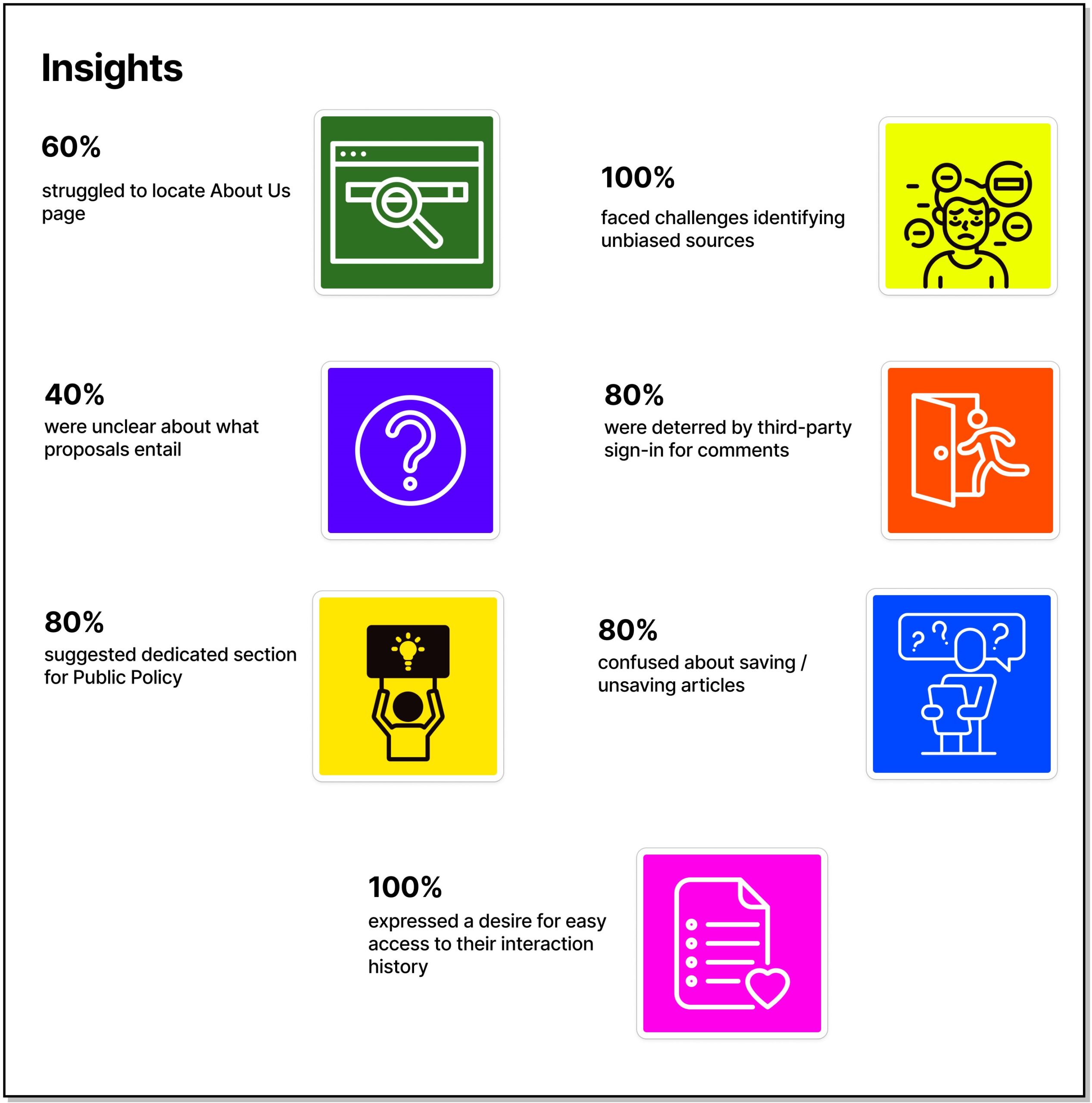
Analyzing the Google Analytics data was crucial at this stage to gain a deeper understanding of how users interacted and what preferences they had on the website. This understanding was essential for refining strategies to enhance user engagement and conversion rates.
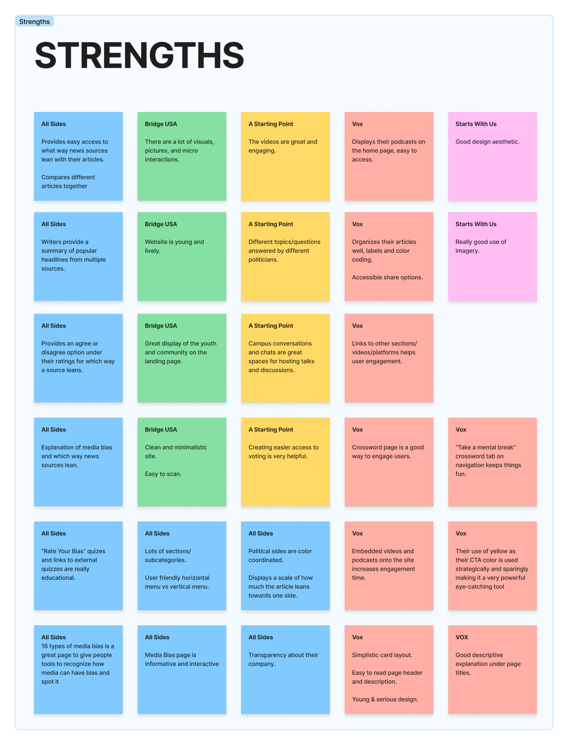
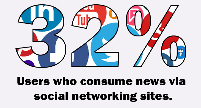
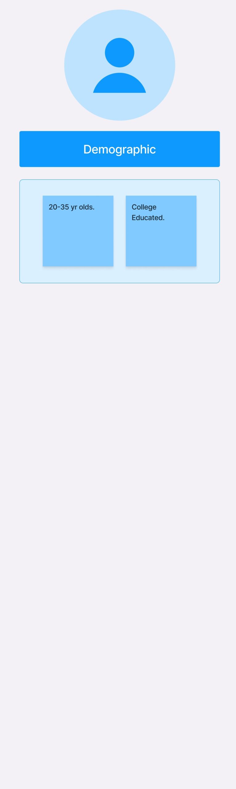
The report revealed that the website had a diverse user base primarily from the USA, with users accessing the site through various browsers and operating systems. While referral and organic search traffic were significant sources of user engagement, mobile and tablet usage remained comparatively low. This suggested a potential area for improvement in mobile responsiveness to better cater to a growing trend of mobile internet users.
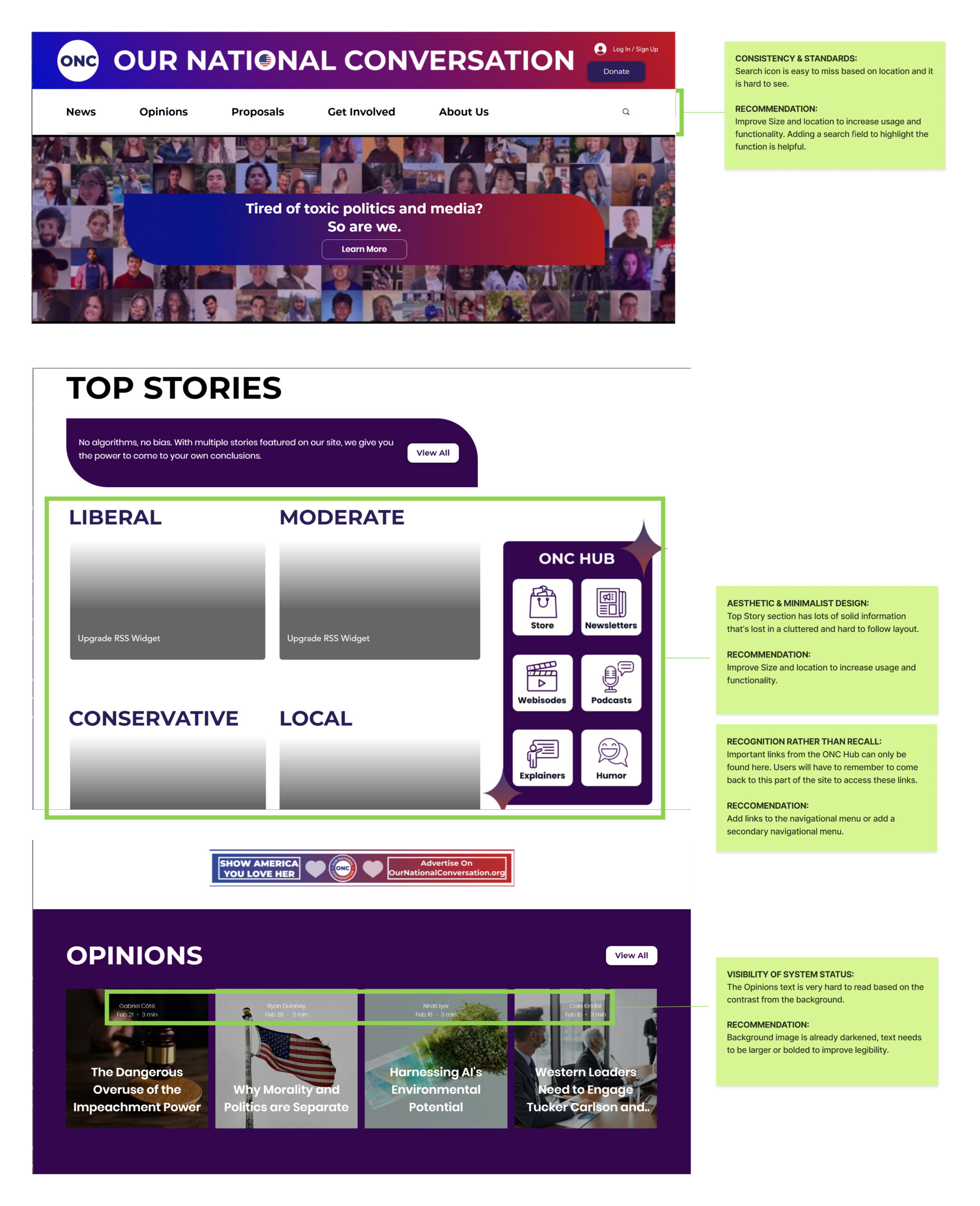
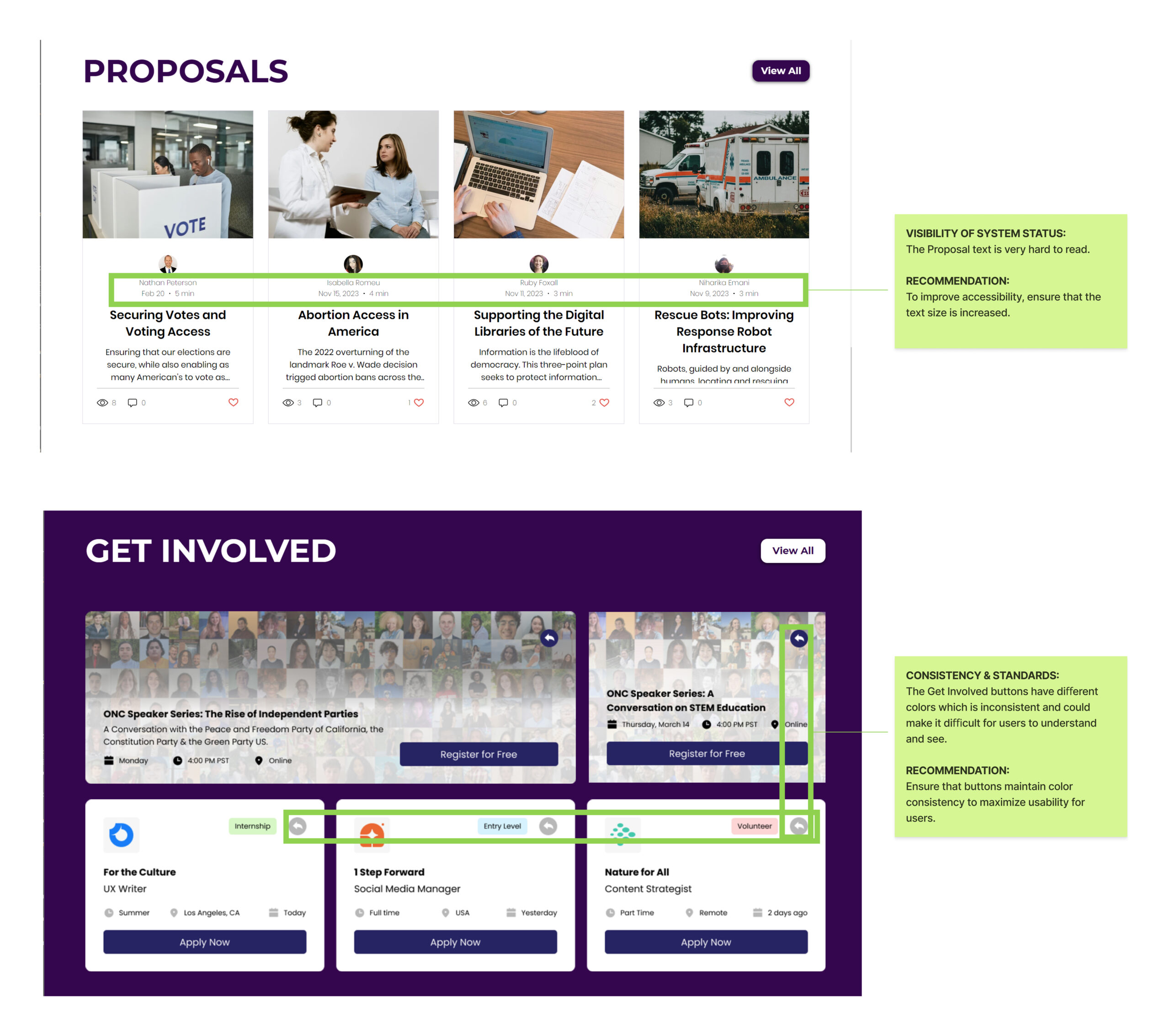
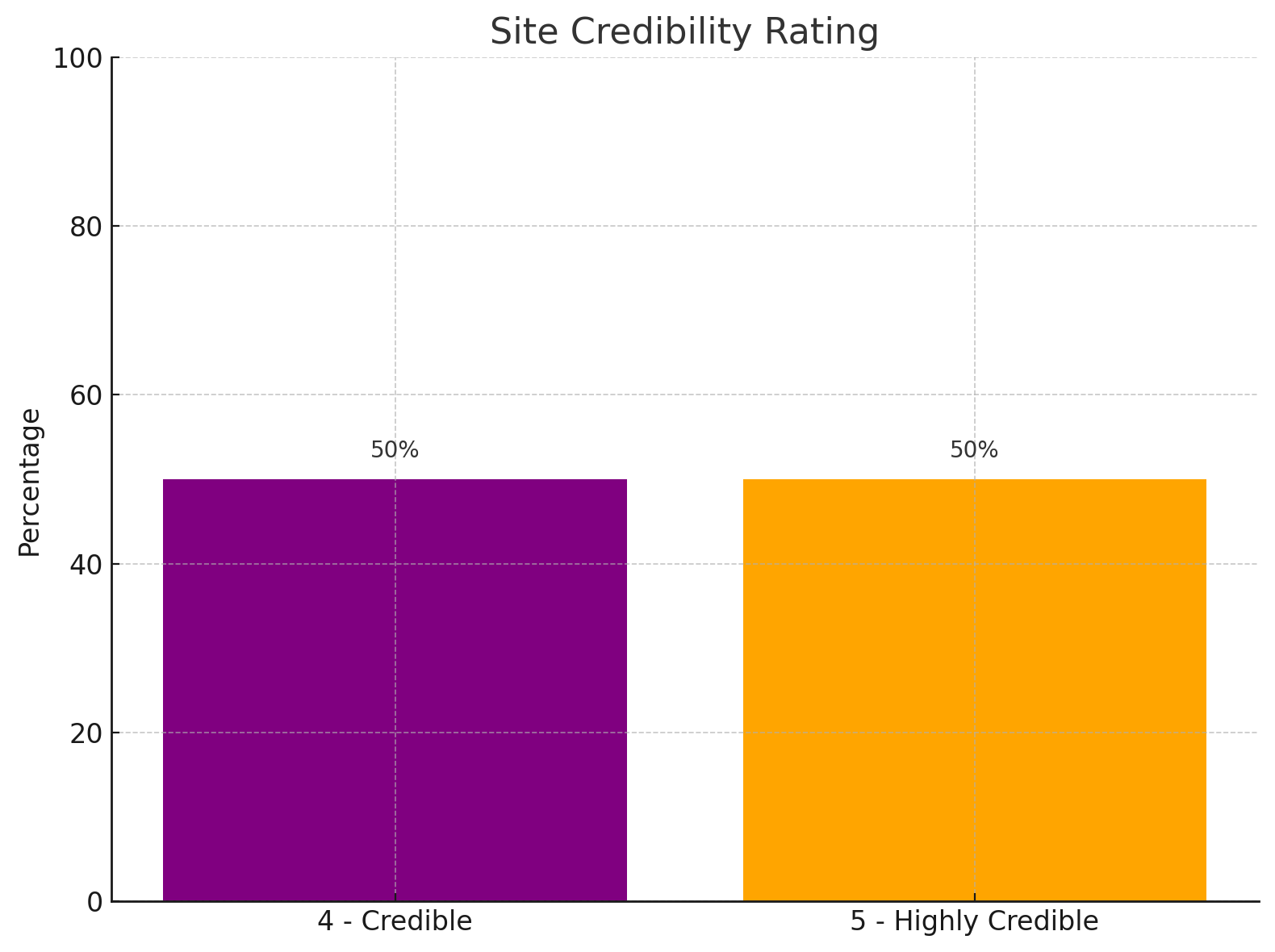
The data showed a 47.4% bounce rate, indicating that nearly half of the visitors left the site without interacting further, which highlighted the need for better user retention and engagement strategies. Enhancing content relevance, improving the overall user experience, and optimizing page load times were suggested strategies to reduce the bounce rate. Additionally, a focused analysis of user behavior on specific pages like Opinions and Proposals could yield valuable insights for further enhancing user experience and increasing conversions. Through targeted content optimization and marketing strategies adapted for different regions, there was an opportunity to drive greater engagement and reduce bounce rates effectively.
Competitive Analysis
In order to get a better understanding of our site’s competitors, a SWOT analysis was conducted on five distinct websites—AllSides.com, BridgeUSA.org, Vox.com, StartsWith.us, and AStartingPoint.com. Each platform uses a different approach to news delivery, political education, and civic engagement, serving diverse audience needs and interests.
AREAS OF OPPORTUNITY FOR ONC.
Enhanced User Engagement and Education:
- All Sides proposes creating an educational space with enhanced news understanding through audio-visual media and interactive elements like quizzes and gamification.
Community Building through Events:
- Bridge USA suggests hosting virtual events and promoting the formation of in-person ONC chapters to foster community connections.
- A Starting Point recommends engaging younger demographics with video chat events and campus-based video series.
Interactive and Personalized Content:
- Starts With Us offers the idea of an interactive proposals/opinions section that includes geographic and political data of users, coupled with polls to identify common beliefs, enhancing discussion dynamism.
- Vox focuses on improving user experience by providing reading times, using multimedia for engagement, introducing mental breaks with gamification, and extending reach through a mobile app.
Demographic Research
The team decided to conduct some secondary research into the target user demographic too better understand who we are designing for. Our research found that individuals aged 18-29 show less interest in local and national news compared to older groups, and they engage in fewer discussions about the news. They also rely less on traditional media platforms like TV and print newspapers for news. However, they lead in consuming news digitally, with about one-third using social networking sites (32%) and news websites or apps (34%) for their news updates. Although generally more critical of the media, showing lower trust and approval of news organizations, their trust increases with familiar news sources.


DEFINE
Target Audience
The target audience for the website redesign, based on surveys from 30 participants, consisted of college-educated 20-35-year-olds in the U.S. interested in politics. They preferred straightforward news but faced barriers like laziness, disinterest, and negative content. They sought reliable, unbiased news but were frustrated by toxic debates, biased sources, and outdated designs. They spent significant time online and preferred in-person discussions over online ones.
Feedback on the ONC website from the surveys highlighted navigation issues, difficulty finding information, and problems with third-party plugins. Users wanted intuitive navigation, interaction history, better explanations, and a balance between text and visuals. The goal was to enhance the ONC website by addressing these issues, making it more intuitive and engaging, and encouraging informed political discussions.
User Pain Points
After conducting research to identify the target demographic, we were able to accurately define the pain points on ONC’s website. This also provided a broader understanding of the behaviors, goals, and expectations of younger generations in the news and civic education landscape. We identified user pain points by synthesizing data from previous research and conducting usability tests with five participants.
Main User Pain Points
- Unorganized navigation
- Overwhelming presentation
- Lack of engaging content
- Lack of social engagement that encourages discussions
- Need for more educational content
- Mismatch between user wants and goals vs. what the ONC website provides
- Mismatch between user expectations and actual content; unclear purpose of the organization
- Functionality issues
- Lack of flexibility on the website
54% of users said they would be more likely to use ONC’s website if the UI was more modern and simple.
21% of users disliked/were confused navigating the website.
46% of users wanted to see more short form content.
60% struggled to find what ONC was about.
100% struggled to find and determine what was unbiased news and was using prior knowledge/guessing.
40% were unsure what Proposals were in the context of ONC.
80% were confused and detoured when they had to sign in again (to a 3rd party app) to comment on a post.
80% did not recognize the upvote and downvote interactions on posts.
80% tried to click the same “save button” to “unsave” the article or source.
No access to previous upvoted or downvoted articles along with comments – 100% of participants said they would like to have access to this information.
100% struggled to determine what was reliable.
80% were confused by the navigation and menu.
60% struggled to find other ONC social media channels.
Affinity Maps
For the ONC website redesign, we used an affinity map to categorize and prioritize features, news article elements, and design ideas. This process helped us identify key areas to focus on and ensure that the final design aligns with user needs and business objectives.
By organizing these ideas into an affinity map, we were able to prioritize the most impactful features and design changes for the ONC website. This structured approach ensures that the redesign effectively addresses user needs, improves engagement, and supports ONC’s mission of fostering informed and empathetic communities.
- Educational Content: Creating sections to educate users on how to vote, explain political proposals, and provide personal development or mental health resources.
- User Engagement: Introducing forums for discussion, feedback mechanisms, and chat rooms to build a community and engage users in specific events.
- Interactive Elements: Incorporating daily polls, gamification features, and interactive media to enhance user participation.
- Bias Awareness: Highlighting bias in news articles and introducing a media bias rating system.
- User Interaction: Enabling rating and commenting on articles, and providing a section for users to ask questions and get factual answers.
- Positive News: Incorporating a section for positive news to balance content.
- Modern Design: Implementing a new, modern logo and sleek, minimal design with both dark and light mode options.
- Accessibility: Ensuring compliance with WCAG, W3C, and ADA guidelines for typography, color, and contrast.
- Enhanced Visuals: Increasing the use of visuals, imagery, and videos to boost user engagement.
- Consistency: Creating a design system for page consistency and relocating the social media tab based on analytics to make it more prominent.
User Personas
The user personas created for the ONC website redesign share common characteristics, paint points, and goals, guiding the design and development process. Each persona seeks reliable, engaging, and easily accessible news sources, while also having unique preferences and pain points.
Commonly, they desire reliable and unbiased news, easy access to current events and policies, and engaging content through discussions and interactive features. They are frustrated by outdated, complex designs and prefer visually appealing, intuitive navigation.
By understanding these personas, the ONC design team created a user-centric website that addresses specific pain points and meets diverse needs, ensuring the ONC website provides relevant news, enhances user engagement, and fosters a satisfying and effective user experience.
Problem Statement
Users aged 20-35 need a platform to learn about US current events and politics without the stigma of toxic politics and bias. In a polarized society, platforms must facilitate constructive dialogue and present balanced perspectives. The ONC website aims to rebuild trust and encourage civic engagement but struggles with intuitive navigation, engaging content, mission visibility, user control, modern design, and organized content.
Problem Statement: The ONC website failed to provide an intuitive, engaging, and balanced news platform for users aged 20-35, resulting in difficulty finding relevant content quickly, overwhelming content presentation, and lack of diverse media formats. The ONC site also lacked a platform that would offer a social aspect, or a social invitation to talk about their opinions about politics from a respectful perspective. The design did not resonate with younger or older audiences, ads detracted from the user experience, and the mission of ONC was not prominently visible, which undermined its purpose and value.
IDEATE
Content Inventory
During the ideate phase of the ONC website redesign, we conducted a comprehensive content inventory to evaluate and categorize all existing content. This process ensured a thorough and effective redesign by identifying gaps, redundancies, and areas for improvement.
Card Sort & Tree Test
To improve content placement and site navigation, we first conducted a card sorting exercise with 10 target users to understand content grouping. Based on their input, we redesigned the navigation bar and then tested it with another 10 users through a tree test. The successful results of the tree test enabled us to finalize the new navigation layout.
Site Map
Using the data from the card sort and tree test, we created a new content inventory and site map. This visual representation of the ONC website’s information architecture illustrates the hierarchy and relationships between different sections and pages to ensure a clear, organized structure that enhances user experience and supports efficient content discovery.
It provided several key benefits:
- Navigation Aid: Helps users understand the structure of the website, making it easier for them to find and access the content they need.
- Design and Development Guide: Assists designers and developers in maintaining consistency and coherence in the website’s layout and navigation.
- Usability Testing: Supports usability testing by identifying potential navigation issues and ensuring all important content areas are easily accessible.
- Content Organization: Ensures content is organized and presented in a way that aligns with user expectations and mental models. Ignite ONC and Forums required their own dedicated links due to low task completion rates, which indicated users had difficulty finding these important pages. Additionally, pages were reorganized and main dropdown links were restructured based on insights from card sorting and tree testing.


By addressing the identified issues with the current information architecture, the redesigned ONC website aims to offer a more intuitive and engaging user experience, fostering better navigation, clearer mission visibility, and deeper user engagement.
Landing Page
The landing page of the ONC website was designed to provide a clear and engaging entry point for users, making it easy to find important content and navigate the site. The structure was thoughtfully organized to highlight key sections and ensure a seamless user experience.
Key Sections of the Landing Page:
- Navigation Bar
- Hero Image
- Top News
- Explain That
- Forums
- Social Media Feeds
- Get Involved
- Strategically Placed Ads
This structured approach to the landing page ensures that users can easily navigate the site, find relevant content quickly, and engage with ONC’s offerings in a meaningful way. By strategically placing ads and integrating social media feeds, the page remains dynamic and interactive, enhancing overall user engagement and retention.
Sketches to Wireframe
The “Sketches to Wireframes” process was essential for developing the ONC website’s landing page. This step involved converting initial sketches into detailed wireframes to ensure a clear and user-friendly interface.
The goal of this process was to create a cohesive, user-centric wireframe that would serve as an outline for the future prototypes. Through sketches and wireframes, we ensured intuitive navigation, prominent positioning of key elements (CTAs, navigation bar, hero image), and a logical organization of content for quick access. This approach ensured the prototype would meet user needs through design choices that were backed by user feedback and testing.


- Prominent Navigation Bar:
Located at the top for easy access to main sections and
Integrated search functionality. - Call to Action (CTA) Buttons:
Strategically placed for engagement (e.g., “Read More,” “Subscribe,” “Get Involved”). - Hero Image:
Positioned below the nav bar with a high-quality image, headline, and link to a full article. - Top Stories Section:
Showcases important and trending news articles with summaries and links. - Explainers Section:
Provides in-depth explanations of current events and complex topics with links to detailed articles.


- Social Media Feed:
Integrates real-time updates from ONC’s social media accounts, encouraging engagement. - Podcasts/Webisodes Section:
Features multimedia content with links to podcasts and webisodes for audio-visual engagement. - Footer:
Provides links to important pages in the website along with copyright information and links to ONC’s social media.
Low-Fi Prototype
With the wireframes designed, the team designed Low fidelity (low-fi) prototypes which were essential in the design process. This allowed us to quickly translate ideas into more detailed forms. Focusing on functionality and layout, these prototypes facilitated early-stage testing, identified usability issues, and gathered feedback from stakeholders and target users. This iterative process addressed major design flaws early, saving time and resources later.
The low-fi prototype further defined the various content pages’ layout, ensuring functionality of key elements like a navigation bar and CTA buttons, and the various sections of content. This approach enabled the design team to make necessary adjustments before moving to high fidelity designs, ensuring a user-centric, functional, and engaging final product that met user needs and expectations.
PROTOTYPE
HiFi Prototype
We initiated the design of the high-fidelity prototype to create a more functional and comprehensive landing page. The team divided the various sections of the landing page and brainstormed ideas based on user data and feedback. We consolidated our design concepts into a cohesive and consistent landing page. Through collaborative effort, the team integrated elements that not only reflected ONC’s mission but also aimed to enhance user retention and engagement. Using these elements of the homepage, we are able to design a template to use for the remainder of the content pages.
- The page header prominently features the ONC logo alongside call-to-action buttons for Sign In and Donate.
- The navigation bar includes links to all available pages, with dropdown menus as needed.
- The hero image showcases a video accompanied by a tagline and a CTA button to encourage users to learn more about ONC.
- Top Stories acts as a hub for new and breaking news through an aggregator.
- Prominent CTA buttons at the beginning and end of the section guide users to the main News page.
- News cards, designed in a Bento Box style, allow users to navigate and browse various sources for each article.
- An intuitive save functionality enables users to save sources or articles to their profile for future viewing.
- The Explain That section features interactive videos that clarify common topics or events.
- The Forum section is prominently displayed to encourage user sign-ups and boost engagement.
- CTA buttons direct users to the relevant pages for more information and further reading.”
- Social Media Feed provides users with glimpses into the various accounts and posts.
- Cards provide imagery pertinent to the post along with a title and time posted.
- Bento box styling modernizes the layout to enhance aesthetics and functionality.
- The Get Involved section features similarly styled cards to maintain design consistency across the site.
- Event cards include a related image, title, and date, allowing users to click for more details about the event.
- The Internships section also uses the same card styling, enabling users to browse available opportunities at ONC, with a prominent CTA button to apply.
- The footer includes a summary of important links, the ONC logo, and social media icons for following ONC.
TEST
Usability Testing
The usability test for the redesigned content pages of Our National Conversation (ONC) aimed to gather user feedback, understand user perceptions, and identify areas for improvement. The test involved five participants and included pre-test questionnaires, task completion, and post-test feedback.
Goal:
- The primary goal was to determine if the redesign better met user expectations, addressed pain points, improved navigation, and enhanced the overall UI.
Data to Support Goal:
- All users completed 100% of the tasks.
- Pre-test insights showed 80% of participants were unable to learn more about ONC on the previous site, and 80% were confused by the navigation bar and menu.
- A/B testing indicated that 80% preferred the redesigned version, aligning better with ONC’s goals.
Key Findings:
User Expectations and Navigation:
- Users easily located the About Us page and returned to the home page using the ONC icon.
- Initial impressions highlighted a clean design, but feedback suggested simplifying the homepage and adding images.
Design and Layout:
- Positive feedback on the Top Stories section for ease of navigation and design.
- Some users found the homepage cluttered and suggested reducing text and increasing visual elements.
Credibility and User Perception:
- Users rated the site’s credibility highly, with most scoring 4 or 5 out of 5.
- Previous comments about the original site described it as confusing and outdated, while the redesign improved perceptions significantly.


Conclusion:
- The usability test revealed that the redesigned ONC website was well-received, with improvements noted in design, readability, and credibility. However, simplifying the content pages and enhancing certain sections could further enhance user experience.
Recommendations:
- Page Simplification: Reduce information overload to prevent overwhelming users.
- Navigation Enhancements: Ensure intuitive and prominently placed navigation elements.
- Design Consistency: Maintain a consistent design language to reinforce credibility and usability.
- Incorporate Feedback: Add more images and simplify content presentation based on user suggestions.
Accessibility Standards
We adhered to core usability principles to ensure that the ONC website redesign provides an excellent user experience. These principles include learnability, efficiency, memorability, error reduction, and user satisfaction.
Accessibility Standards
The redesign complies with WCAG 2.1 guidelines, ensuring text readability with appropriate contrast ratios, providing alt text for images, and making all interactive elements keyboard navigable.
User-Centered Design Approach
Our approach was deeply rooted in user-centered design. We conducted extensive user research, including surveys and interviews, to understand user needs. Detailed user personas and real-life scenarios guided our design decisions.


FINAL DESIGN
Style Guide
Once the team made final decisions on the design layout of the website, the style guide was created to establish a cohesive and visually appealing design that enhanced user experience and engagement. Additionally, this guide served as a resource for future designers to help maintain consistency and standards across various other media and designs, ensuring the ONC brand remained unified and recognizable.
TYPOGRAPHY
- Fonts: We used Montserrat and Poppins fonts to ensure a modern and clean appearance.
- Font Style: Both fonts were sans serif, chosen for their better legibility and readability across different devices and screen sizes.
- Headings and Body Text:
- Headings: Montserrat, bold, sizes ranged from 13px to 56px for Desktop 14px to 24px for Mobile.
- Body Text: Poppins, regular, 18px for Desktop, and 16px for Mobile.
COLOR PALETTE
- Primary Colors:
- ONC Gradient: A distinct blend of red, blue, and purple to represent ONC’s brand.
- White: #FFFFFF, used for backgrounds to maintain a clean and open feel.
- Black: #313638, used for text and essential elements for strong contrast and readability.
- Secondary Colors:
- Gray: #6c6967, for descriptive text and icon labels.
- Light Gray: #F8F6F4, for card backgrounds and accents..
COMMON ELEMENTS
- Call to Action (CTA) Buttons:
- Design: Simple and clear with high contrast colors for visibility.
- Colors: Use the ONC gradient (red/blue/purple) for primary actions, and neutral tones (white and black) for secondary actions.
- Size: Standard button sizes are 32px height and variable width to accommodate different text lengths.
GRID SYSTEM
- Structure: A flexible grid system to ensure content was well-organized and adaptable to various screen sizes.
- Margins and Padding: Consistent margins and padding to create a balanced layout.
- Desktop: 1440px wide grid with 12 columns and 80px gutters.
- Tablet: 680px wide grid with 8 columns and 40px gutters.
- Mobile: 320px wide grid with 4 columns and 16px gutters.
- Responsive Design: Ensured the website looked and functioned well on all devices, from large desktop monitors to small mobile screens.
Final Prototype
The goal of the final prototype was to incorporate iterative changes based on usability testing feedback and ensure the design met user needs, stakeholder expectations, and accessibility standards. We aimed to create a more modern, sleek, and user-friendly interface that enhances user engagement and satisfaction while aligning with ONC’s mission and values.
- The two Header CTA buttons were redesigned to meet accessibility standards and establish a clear button hierarchy.
- The CTA button in the hero image was removed, as users found it redundant and unnecessary.
- The news cards underwent a design overhaul, eliminating the hard-lined borders in favor of a sleek, flowing style with a drop shadow and a slightly darker background.
- The font color for the body and descriptive text was adjusted to enhance contrast with the new card design.
- The placement of news sources was redesigned to the bottom of the cards, featuring larger, scrollable news icon buttons.
- To meet stakeholders’ requirements for ads and sponsorships, ads were strategically placed out of the way of the news content, following an F-shaped reading pattern.
- CTA buttons throughout the website were also modified to a white fill with a less rounded appearance to improve contrast and readability of the button label text.
- The footer remained unchanged, except for the incorporation of the new modernized ONC logo from the header.


REFLECTIONS
POST-MORTEM
The ONC website redesign project was a comprehensive effort aimed at significantly improving user engagement and satisfaction. The redesign focused on creating a modern, user-friendly interface that would effectively support ONC’s mission. The project involved extensive user research, multiple iterations based on usability testing feedback, and a concerted effort to meet accessibility standards.
Successes
- Enhanced User Engagement: The new design improved user interaction with key sections like Top Stories and the Forums.
- Establishing Target User Demographic: Further honed the organization’s content strategy to better suit user needs, focusing on Gen Z and young adults.
- Improved Accessibility: Enhancements to text contrast, CTA buttons, and overall design layout significantly boosted legibility and visibility, ensuring optimal user engagement and interaction.
- Consistent Design: The use of a cohesive style guide maintained design consistency across the site by matching users’ expectations and mental models.
- Financial Support: The organization secured five substantial grants and a $10,000 Google Ad grant, thanks to the enhanced website design.
Challenges
- Initial Navigation Issues: Users initially struggled with site navigation, necessitating multiple iterations to simplify the interface.
- Balancing Content Density: Finding the right balance between content richness and readability without overwhelming users was challenging.
- Ad Placement: Ensuring that advertisements did not disrupt the user experience while meeting stakeholder requirements required strategic positioning.
KEY LEARNINGS
- User-Centered Design is Crucial: Iterative design based on usability feedback is essential for creating a user-friendly interface.
- Information Architecture: Proper testing through card sorts and tree tests provided valuable data to improve site navigation.
- Consistency is Key: Adhering to a style guide helps maintain a cohesive and professional look across all pages.
- Accessibility Enhancements Improve Usability for All: Ensuring high contrast and keyboard accessibility benefits all users, not just those with disabilities.
- Responsive Design: Planning for a responsive mobile site from the outset ensures a seamless user experience across devices.